<?xml version="1.0" encoding="utf-8"?><feed xmlns="http://www.w3.org/2005/Atom" ><generator uri="https://jekyllrb.com/" version="3.10.0">Jekyll</generator><link href="https://julietkelson.com/feed.xml" rel="self" type="application/atom+xml" /><link href="https://julietkelson.com/" rel="alternate" type="text/html" /><updated>2026-07-23T01:09:36+00:00</updated><id>https://julietkelson.com/feed.xml</id><title type="html">Juliet Kelson</title><subtitle>Senior data analyst at the Minnesota Star Tribune — data essays, projects, and writing by Juliet Kelson.</subtitle><entry><title type="html">Did we cover it? Building a search gap detector for newsrooms</title><link href="https://julietkelson.com/from%20work/trend-tracker/" rel="alternate" type="text/html" title="Did we cover it? Building a search gap detector for newsrooms" /><published>2026-06-25T14:00:00+00:00</published><updated>2026-06-25T14:00:00+00:00</updated><id>https://julietkelson.com/from%20work/trend-tracker</id><content type="html" xml:base="https://julietkelson.com/from%20work/trend-tracker/"><![CDATA[<p><em>Code and full documentation on <a href="https://github.com/julietkelson/trend-tracker">GitHub</a>.</em></p>

<hr />

<p>Google Search Console tells you which searches lead readers to your site. Your CMS tells you what you published. What it doesn’t tell you is if those two things overlap — whether readers were searching for something your newsroom didn’t write about.</p>

<p>That question is the whole point of this project. I built a pipeline at the Star Tribune that detects rising search queries, checks whether we published a story on the topic, and measures the gap if we did.</p>

<p>Here’s how it works, what I learned building it, and how to run it yourself.</p>

<hr />

<h2 id="the-problem">The problem</h2>

<p>On any given day, thousands of Google searches send readers to startribune.com. Some of those queries spike because something happened in the news — a Timberwolves playoff run, a wildfire near Ely, a storm rolling into the Twin Cities. When impressions on a query triple their normal level for two days in a row, that’s a signal: readers want coverage.</p>

<p>The question is whether we provided it. And answering it required a pipeline like this one.</p>

<h2 id="trend-detection">Trend detection</h2>

<p>The first step is finding the spikes. For each search query in Google Search Console, I compute a 14-day rolling average of daily impressions — what “normal” looks like for that query. Then I compare each day’s actual impressions to that baseline.</p>

<p>If a query hits 3× its baseline for two consecutive days, it’s flagged as a trend onset. That consecutive-days requirement filters out noise: a single day spike is often a data artifact or a one-off news event. Two days in a row suggests real, sustained reader interest. There’s also an impression floor — queries below 50 daily impressions are excluded, so we’re not flagging “trends” where the count goes from 2 to 6.</p>

<div class="language-python highlighter-rouge"><div class="highlight"><pre class="highlight"><code><span class="c1"># Rolling 14-day mean, shifted one day forward (no lookahead bias)
</span><span class="n">baseline</span>   <span class="o">=</span> <span class="n">pivot</span><span class="p">.</span><span class="n">rolling</span><span class="p">(</span><span class="n">window</span><span class="o">=</span><span class="mi">14</span><span class="p">,</span> <span class="n">min_periods</span><span class="o">=</span><span class="mi">3</span><span class="p">).</span><span class="n">mean</span><span class="p">().</span><span class="n">shift</span><span class="p">(</span><span class="mi">1</span><span class="p">)</span>
<span class="n">spike_ratio</span> <span class="o">=</span> <span class="n">pivot</span> <span class="o">/</span> <span class="n">baseline</span><span class="p">.</span><span class="n">replace</span><span class="p">(</span><span class="mi">0</span><span class="p">,</span> <span class="nb">float</span><span class="p">(</span><span class="s">"nan"</span><span class="p">))</span>
<span class="n">is_spiking</span>  <span class="o">=</span> <span class="p">(</span><span class="n">spike_ratio</span> <span class="o">&gt;=</span> <span class="mf">3.0</span><span class="p">)</span> <span class="o">&amp;</span> <span class="p">(</span><span class="n">pivot</span> <span class="o">&gt;=</span> <span class="mi">50</span><span class="p">)</span>
</code></pre></div></div>

<p>The 14-day window captures two full weekly cycles, which matters because search volume has weekly patterns — news queries tend to spike on weekdays and quiet on weekends. A shorter window would mistake Tuesday for trending.</p>

<h2 id="matching-trends-to-articles">Matching trends to articles</h2>

<p>Once I have a list of trending queries, I need to check whether we published something. The naive approach — exact string matching — fails immediately. A reader searching “Wolves” won’t match an article with “Timberwolves” in the headline. “Ant” won’t match “Anthony Edwards.” Jaccard similarity on keywords gets you part of the way there. (Quick refresher: Jaccard scores how much two phrases overlap, from 0 to 1 — the words they share divided by the total unique words across both.) But it has a precision problem: lower the threshold to catch more matches and you start pulling in articles that share a word but not a topic.</p>

<p>I ended up with a two-stage approach.</p>

<p><strong>Stage 1: Jaccard pre-filter.</strong> For each trending query, I tokenize the query and every article headline + URL slug from a three-week window around the trend onset (7 days before through 14 days after). Any article that scores at least 0.05 Jaccard similarity with the query makes the candidate list. This is loose by design — the point is to catch near-misses like “Wolves” articles for a “timberwolves” query, not to make a final decision.</p>

<p><strong>Stage 2: Cortex confirmation.</strong> The candidate list goes to Snowflake Cortex COMPLETE (<code class="language-plaintext highlighter-rouge">mistral-7b</code>) in a single batched SQL call. The prompt template is parameterized on two env vars — <code class="language-plaintext highlighter-rouge">PUBLICATION_NAME</code> and <code class="language-plaintext highlighter-rouge">PUBLICATION_LOCATION</code> — so any paper can drop in its own brand:</p>

<div class="language-plaintext highlighter-rouge"><div class="highlight"><pre class="highlight"><code>The {publication_name} is a {publication_location} newspaper.
A reader searched for "{query}".
Did the {publication_name} publish an article specifically about this topic?
Headline: "{headline}"
Section: {section}
Answer yes or no.
</code></pre></div></div>

<p>Cortex says yes or no. Only yes candidates make it into the results. The whole thing costs under a tenth of a cent per pipeline run.</p>

<p>If Cortex is unavailable, the pipeline falls back to a stricter Jaccard threshold (0.15) so it never crashes — it just becomes slightly less generous.</p>

<h2 id="a-case-study-in-false-positives">A case study in false positives</h2>

<p>The first version of the Cortex prompt didn’t include the article’s section or anything about the publication. It just asked: “Did this paper publish an article about this topic?”</p>

<p>That broke on “anthony edwards.” A reader searching for Anthony Edwards is almost certainly looking for the Timberwolves point guard. But a News-section piece with “Anthony Fauci” in the headline shares the token “anthony” with the query — Jaccard flagged it as a candidate, and the underspecified prompt confirmed it as a match.</p>

<p>The fix was two lines: add the publication’s geography and add the article’s section. With that context, Cortex correctly rejects a News article about a public health official for a query that almost certainly means a basketball player.</p>

<div class="language-python highlighter-rouge"><div class="highlight"><pre class="highlight"><code><span class="n">prompt</span> <span class="o">=</span> <span class="p">(</span>
    <span class="sa">f</span><span class="s">"The </span><span class="si">{</span><span class="n">PUBLICATION_NAME</span><span class="si">}</span><span class="s"> is a </span><span class="si">{</span><span class="n">PUBLICATION_LOCATION</span><span class="si">}</span><span class="s"> newspaper. "</span>
    <span class="sa">f</span><span class="s">"A reader searched for </span><span class="se">\"</span><span class="si">{</span><span class="n">query</span><span class="si">}</span><span class="se">\"</span><span class="s">. "</span>
    <span class="sa">f</span><span class="s">"Did the </span><span class="si">{</span><span class="n">PUBLICATION_NAME</span><span class="si">}</span><span class="s"> publish an article specifically about this topic?</span><span class="se">\n</span><span class="s">"</span>
    <span class="sa">f</span><span class="s">"Headline: </span><span class="se">\"</span><span class="si">{</span><span class="n">headline</span><span class="si">}</span><span class="se">\"\n</span><span class="s">"</span>
    <span class="sa">f</span><span class="s">"Section: </span><span class="si">{</span><span class="n">section</span><span class="si">}</span><span class="se">\n</span><span class="s">"</span>
    <span class="sa">f</span><span class="s">"Answer yes or no."</span>
<span class="p">)</span>
</code></pre></div></div>

<p>The lesson: LLMs can do good binary classification on short prompts, but they need enough context to resolve ambiguity. “Did we write about X?” is underspecified. “Did this regional paper’s Sports section cover the search query X?” is not.</p>

<h2 id="what-the-output-looks-like">What the output looks like</h2>

<p>Each pipeline run writes one row per trending query × matching article into a table called <code class="language-plaintext highlighter-rouge">TREND_PUBLISH_GAP</code>. The repo’s <a href="https://github.com/julietkelson/trend-tracker/blob/main/examples/sample_output.csv">synthetic example</a> has 12 trending queries for a fictional local newsroom — 7 covered, 5 not. Here’s a slice:</p>

<table>
  <thead>
    <tr>
      <th>Query</th>
      <th>Spike</th>
      <th>Headline</th>
      <th>Gap (hrs)</th>
      <th>Status</th>
    </tr>
  </thead>
  <tbody>
    <tr>
      <td>city council vote</td>
      <td>4.2×</td>
      <td>City Council Approves Downtown Redevelopment Plan…</td>
      <td>-96</td>
      <td><code class="language-plaintext highlighter-rouge">ahead_of_trend</code></td>
    </tr>
    <tr>
      <td>state fair tickets</td>
      <td>5.1×</td>
      <td>State Fair Tickets Go On Sale Next Week…</td>
      <td>-24</td>
      <td><code class="language-plaintext highlighter-rouge">within_3_days</code></td>
    </tr>
    <tr>
      <td>mayor press conference</td>
      <td>3.8×</td>
      <td>Mayor Outlines Budget Priorities Ahead of Council Vote</td>
      <td>-6</td>
      <td><code class="language-plaintext highlighter-rouge">same_day_before</code></td>
    </tr>
    <tr>
      <td>local election results</td>
      <td>4.5×</td>
      <td>Tuesday’s Election Results: Three Incumbents Hold Seats</td>
      <td>12</td>
      <td><code class="language-plaintext highlighter-rouge">within_24h</code></td>
    </tr>
    <tr>
      <td>zoning meeting</td>
      <td>3.4×</td>
      <td>Planning Commission Tables Decision on West Side Rezoning</td>
      <td>96</td>
      <td><code class="language-plaintext highlighter-rouge">within_week</code></td>
    </tr>
    <tr>
      <td>restaurant week</td>
      <td>4.0×</td>
      <td>—</td>
      <td>—</td>
      <td><code class="language-plaintext highlighter-rouge">no_coverage</code></td>
    </tr>
    <tr>
      <td>playoff schedule</td>
      <td>5.5×</td>
      <td>—</td>
      <td>—</td>
      <td><code class="language-plaintext highlighter-rouge">no_coverage</code></td>
    </tr>
  </tbody>
</table>

<p>Each row is a finding the pipeline is asking the newsroom to react to.</p>

<ul>
  <li><strong>Negative gap hours</strong> mean the story published <em>before</em> readers started searching — coverage was ahead of the trend. The reporting was already there when readers came looking.</li>
  <li><strong>Small positive gap hours</strong> mean the newsroom moved quickly once the trend started.</li>
  <li><strong><code class="language-plaintext highlighter-rouge">no_coverage</code></strong> means the trend fired but nothing matched, even after Cortex. These are the gaps the pipeline exists to surface.</li>
</ul>

<p>The categorical <code class="language-plaintext highlighter-rouge">GAP_STATUS</code> values are bucketed from <code class="language-plaintext highlighter-rouge">GAP_HOURS</code>:</p>

<table>
  <thead>
    <tr>
      <th>Status</th>
      <th>Definition</th>
    </tr>
  </thead>
  <tbody>
    <tr>
      <td><code class="language-plaintext highlighter-rouge">ahead_of_trend</code></td>
      <td>Published 3+ days before the trend peaked</td>
    </tr>
    <tr>
      <td><code class="language-plaintext highlighter-rouge">proactive</code></td>
      <td>Published 1–3 days before</td>
    </tr>
    <tr>
      <td><code class="language-plaintext highlighter-rouge">same_day_before</code></td>
      <td>Published same day, before peak</td>
    </tr>
    <tr>
      <td><code class="language-plaintext highlighter-rouge">within_24h</code></td>
      <td>Published within 24 hours of peak</td>
    </tr>
    <tr>
      <td><code class="language-plaintext highlighter-rouge">within_3_days</code></td>
      <td>Published within 72 hours</td>
    </tr>
    <tr>
      <td><code class="language-plaintext highlighter-rouge">within_week</code></td>
      <td>Published 1–7 days after</td>
    </tr>
    <tr>
      <td><code class="language-plaintext highlighter-rouge">late</code></td>
      <td>Published more than a week after</td>
    </tr>
    <tr>
      <td><code class="language-plaintext highlighter-rouge">no_coverage</code></td>
      <td>No matching article found</td>
    </tr>
  </tbody>
</table>

<p>The point of these buckets isn’t to grade a newsroom — <code class="language-plaintext highlighter-rouge">ahead_of_trend</code> isn’t always praise (the coverage may have <em>driven</em> the interest, or demand was already building below the spike threshold), and <code class="language-plaintext highlighter-rouge">no_coverage</code> isn’t always failure (some trends shouldn’t be covered, and the matcher misses things even with the LLM pass). The buckets are there so dashboards can filter, and so editors can ask the right follow-up question for each row instead of treating all “gaps” the same.</p>

<p>The pipeline also publishes a <code class="language-plaintext highlighter-rouge">TRENDING_NOT_COVERED</code> view that filters to just the last fourteen days of uncovered trends — that’s the one you’d look at before an editorial meeting.</p>

<h2 id="cost">Cost</h2>

<p>Cortex COMPLETE with <code class="language-plaintext highlighter-rouge">mistral-7b</code> runs at fractions of a cent per pipeline run. Cortex is only called for candidates that clear the Jaccard pre-filter, so the call volume stays small. At roughly thirty trending queries per run with a handful of candidates each — daily cadence — the annual Cortex bill lands under $0.40. Warehouse compute is shared with whatever Snowflake usage your team already has, so it adds little to the bill.</p>

<h2 id="running-it-yourself">Running it yourself</h2>

<p>The full code is on <a href="https://github.com/julietkelson/trend-tracker">GitHub</a>. It ships in two flavors:</p>

<ul>
  <li><strong>Snowflake</strong> — <code class="language-plaintext highlighter-rouge">pipeline.py</code>, <code class="language-plaintext highlighter-rouge">gsc_pull.py</code>, <code class="language-plaintext highlighter-rouge">load_gsc_csv.py</code>. The production-tested path. Uses Snowflake Cortex <code class="language-plaintext highlighter-rouge">COMPLETE</code> for the LLM step.</li>
  <li><strong>BigQuery</strong> — the same scripts with <code class="language-plaintext highlighter-rouge">_bigquery</code> suffixes. A mirror that has not been run end-to-end; useful as a starting point if BQ is your warehouse, with <code class="language-plaintext highlighter-rouge">ML.GENERATE_TEXT</code> against a remote Gemini model standing in for Cortex. Expect to debug.</li>
</ul>

<p>The Snowflake setup, in brief:</p>

<div class="language-bash highlighter-rouge"><div class="highlight"><pre class="highlight"><code>git clone https://github.com/julietkelson/trend-tracker
<span class="nb">cd </span>trend-tracker
pip <span class="nb">install</span> <span class="nt">-r</span> requirements.txt
<span class="nb">cp</span> .env.example .env
<span class="c"># fill in your Snowflake + GSC credentials and your publication context</span>
python gsc_pull.py <span class="nt">--backfill</span>   <span class="c"># or load_gsc_csv.py for the CSV path</span>
python pipeline.py
</code></pre></div></div>

<p>A few pieces worth calling out:</p>

<p><strong>Publication context is parameterized.</strong> <code class="language-plaintext highlighter-rouge">PUBLICATION_NAME</code> and <code class="language-plaintext highlighter-rouge">PUBLICATION_LOCATION</code> in <code class="language-plaintext highlighter-rouge">.env</code> get spliced into the Cortex prompt. That’s the same fix from the false-positives section earlier — instead of hardcoding “Minnesota newspaper,” the matcher learns <em>your</em> paper’s geography and brand at runtime. Generic prompts confuse Anthony Edwards for Anthony Fauci; brand-aware ones don’t.</p>

<p><strong>Your CMS table.</strong> Article matching reads from a Snowflake table named in <code class="language-plaintext highlighter-rouge">ARC_TABLE</code>. The shipped <code class="language-plaintext highlighter-rouge">load_arc()</code> assumes Arc Publishing columns; if your CMS exports look different, that one function is where to adjust. Required fields are documented in the README.</p>

<p><strong>Evergreen sections</strong> like Obituaries, Games, and Weather are excluded from the gap analysis by default, since they aren’t news-driven. Override the list in <code class="language-plaintext highlighter-rouge">pipeline.py</code> for your sections.</p>

<p><strong>Tests.</strong> A <code class="language-plaintext highlighter-rouge">pytest</code> suite runs against mocked warehouse connections, so trend detection and matching logic can be verified without credentials.</p>

<h2 id="whats-next">What’s next</h2>

<p>The repo ships both ingestion paths: <code class="language-plaintext highlighter-rouge">gsc_pull.py</code> uses a GCP service account against the Search Console API, and <code class="language-plaintext highlighter-rouge">load_gsc_csv.py</code> works off the GSC UI export for one-off retrospectives. The piece still missing is scheduling. A production deployment would need key-pair auth (<code class="language-plaintext highlighter-rouge">SNOWFLAKE_AUTHENTICATOR=snowflake_jwt</code>) instead of SSO, and a real scheduler — Airflow, cron, whatever your org runs — to fire daily before an editorial meeting.</p>

<p>If you build something similar for your newsroom, <a href="mailto:kelsonjuliet@gmail.com">reach out</a> and let me know how it goes!</p>]]></content><author><name></name></author><category term="From Work" /><summary type="html"><![CDATA[A search gap detector for newsrooms — detects trending Google queries, matches them to published articles with Snowflake Cortex, and surfaces editorial gaps. By Juliet Kelson.]]></summary></entry><entry><title type="html">New Subscriber Paths: the newsroom metric that measures what people pay for</title><link href="https://julietkelson.com/from%20work/new-subscriber-paths/" rel="alternate" type="text/html" title="New Subscriber Paths: the newsroom metric that measures what people pay for" /><published>2025-07-14T14:00:00+00:00</published><updated>2025-07-14T14:00:00+00:00</updated><id>https://julietkelson.com/from%20work/new-subscriber-paths</id><content type="html" xml:base="https://julietkelson.com/from%20work/new-subscriber-paths/"><![CDATA[<p><em>Presented at <a href="https://drive.google.com/file/d/1yH-A4iYyqsf3s5wE0K5YkwasNUvM76KC/view">SRCCON 2025</a>. The numbers are proprietary, so the chart is anonymized. The method, and how it changed the Analytics–News relationship, are the parts worth sharing.</em></p>

<hr />

<p>Most newsrooms measure content by clicks. A story does well, it gets a lot of pageviews; it does poorly, it doesn’t. That’s a useful signal for reach. It’s a terrible signal for value, because the stories people <em>read</em> and the stories people <em>pay for</em> are not the same set.</p>

<p>I co-created New Subscriber Paths at the Star Tribune to measure the second one. The goal was a metric the newsroom could trust to answer a question dashboards weren’t really answering: <em>what kinds of journalism actually drive subscriptions?</em></p>

<p>This is how it works, and how it changed the way News and Analytics talk to each other.</p>

<hr />

<h2 id="how-it-works">How it works</h2>

<p>A <strong>path</strong> to subscription includes every article a reader viewed in the 30 days before they subscribed. Each new subscriber has one. The metric counts how often each article shows up across all of those paths.</p>

<p>In other words: a story’s path count = the number of users who purchased a subscription in the 30 days after reading the story. That turns out to have a much tighter relationship with subscription conversion than session volume alone.</p>

<p>Once you have paths per story, articles can be tagged with levers — story archetype, topic, location, framing, discovery strategy, photos, video, galleries, content vertical — to look for patterns. The output of that analysis gives a view of what kinds of journalism people are actually willing to pay for, not just what they click on, and how different elements of that journalism affect acquisition. Something few other newsrooms are measuring.</p>

<p>Paths aren’t a whole-picture metric. They don’t measure retention, reach, engagement, or readers who can’t afford to subscribe. They’re a <em>conversion signal</em>, full stop. Discounted paywall offers also create noise unrelated to content, so those periods, among other features, should be controlled for when reporting and modeling expected paths.</p>

<h2 id="how-we-built-it">How we built it</h2>

<p>GA and Piano data give us readership and subscription activity tied to an individual user, which is what makes the path possible: every subscriber’s last 30 days of reading can be reconstructed and counted.</p>

<p>Pipelines running in GitHub Actions derive paths each day. A separate model running in the same workflow predicts a probability curve for how many paths a story <em>should</em> have, given its days since publish, content section, and the paywall intro offer that was in market at the time. The output gets bucketed based on how it aligns to expectations, and that bucketed view is what the newsroom sees. Buckets keep the conversation about whether a story performed against prediction, not whether it had a big number.</p>

<h2 id="the-relationship-part">The relationship part</h2>

<p>This wasn’t only an analytics project — it reshaped how News and Analytics work together. The process was collaborative from the start: editors helped define what they wanted to know, and we built the infrastructure and analysis to answer it. The result was a shared language for talking about content value that both teams actually trusted.</p>

<p>That last word is the one that mattered. Newsrooms are skeptical of analytics for good reasons — most of the metrics they see don’t measure the journalism itself, and they’ve watched data get used as a stick instead of a carrot. Paths gave editors a number that lined up with their instincts about what was working, which meant they used it to inform their content strategy.</p>

<p>Trust didn’t appear on its own. To introduce Paths, we sat down with every department in the newsroom and walked through the metric, what it measured, what it didn’t, where the buckets came from. We trained editors and reporters on the dashboards directly, and held regular office hours so people could come in with a question, or with a pattern they were seeing, and ask whether it was real.</p>

<h2 id="how-we-iterated">How we iterated</h2>

<p>Once Paths was live, the question shifted from <em>does it work?</em> to <em>what is it telling us?</em> The answer kept changing depending on which lever you looked at. So we ran deep dives, one question at a time, whenever curiosity from the newsroom or our team made one worth chasing.</p>

<p>When there was interest in multimedia, we pulled apart how photos, video, and galleries affect paths. When the question turned to graphics, we looked at data visualization and embedded charts the same way. We added topic and archetype modeling so editors could ask sharper questions: when writing about a given topic, do potential subscribers convert more when the story is written in feature style or inverted pyramid?</p>

<p>Each deep dive ended in a presentation and discussion with team leads and editors. The agenda was largely shaped by their questions. Paths wasn’t a one-time finding the newsroom got a deck on and moved past. It was something they kept asking new questions of, and we kept answering them.</p>

<h2 id="impact">Impact</h2>

<p>The reporting metric and the way it informs content strategy contributed to:</p>

<ul>
  <li><strong>~$1M</strong> in annual subscriber revenue added above predictions each month</li>
  <li><strong>+3.1K new subscribers per month</strong> above predictions since Paths began informing content strategy</li>
  <li>A <strong>News × Analytics</strong> working relationship that didn’t exist in the same form before</li>
</ul>

<p>The numbers are proprietary so the chart below runs without axes, but the shape is the point. How often an article appears across subscription paths is tightly correlated with the number of new subscribers who started reading it within 30 days.</p>

<div class="work-chart-card" role="img" aria-label="Scatter plot showing a positive correlation between how often an article appeared in subscriber paths and the number of new subscribers, March 2021 through May 2024. Axis values are anonymized." style="max-width: 720px; margin: 34px auto;">
  <div class="work-chart-card__chart">
    <svg viewBox="0 0 280 150" aria-hidden="true">
      <text x="4" y="75" transform="rotate(-90 4 75)" font-family="var(--fn-mono)" font-size="7" text-anchor="middle" fill="var(--fn-ink2)">subscriptions</text>
      <text x="140" y="146" font-family="var(--fn-mono)" font-size="7" text-anchor="middle" fill="var(--fn-ink2)">number of times an article was in a path</text>
      <line x1="8" x2="272" y1="130" y2="130" stroke="var(--fn-ruleSoft)" stroke-width="1" />
      <line x1="8" x2="272" y1="108" y2="108" stroke="var(--fn-ruleSoft)" stroke-width="0.75" stroke-dasharray="2 4" />
      <line x1="8" x2="272" y1="86" y2="86" stroke="var(--fn-ruleSoft)" stroke-width="0.75" stroke-dasharray="2 4" />
      <line x1="8" x2="272" y1="63" y2="63" stroke="var(--fn-ruleSoft)" stroke-width="0.75" stroke-dasharray="2 4" />
      <line x1="8" x2="272" y1="41" y2="41" stroke="var(--fn-ruleSoft)" stroke-width="0.75" stroke-dasharray="2 4" />
      <line x1="8" x2="272" y1="19" y2="19" stroke="var(--fn-ruleSoft)" stroke-width="0.75" stroke-dasharray="2 4" />
      <line x1="68" x2="68" y1="12" y2="130" stroke="var(--fn-ruleSoft)" stroke-width="0.75" stroke-dasharray="2 4" />
      <line x1="128" x2="128" y1="12" y2="130" stroke="var(--fn-ruleSoft)" stroke-width="0.75" stroke-dasharray="2 4" />
      <line x1="188" x2="188" y1="12" y2="130" stroke="var(--fn-ruleSoft)" stroke-width="0.75" stroke-dasharray="2 4" />
      <line x1="248" x2="248" y1="12" y2="130" stroke="var(--fn-ruleSoft)" stroke-width="0.75" stroke-dasharray="2 4" />
      <polygon points="8,93 272,19 272,49 8,123" fill="var(--fn-forest)" fill-opacity="0.08" />
      <line x1="8" y1="108" x2="272" y2="34" stroke="var(--fn-forest)" stroke-width="1.5" stroke-opacity="0.7" />
      <circle cx="11.6" cy="127.8" r="2" fill="var(--fn-forest)" fill-opacity="0.6" />
      <circle cx="17.6" cy="118.9" r="2" fill="var(--fn-forest)" fill-opacity="0.6" />
      <circle cx="20" cy="118.2" r="2" fill="var(--fn-forest)" fill-opacity="0.6" />
      <circle cx="23.6" cy="115.3" r="2" fill="var(--fn-forest)" fill-opacity="0.6" />
      <circle cx="26" cy="106.4" r="2" fill="var(--fn-forest)" fill-opacity="0.6" />
      <circle cx="29.4" cy="102.7" r="2" fill="var(--fn-forest)" fill-opacity="0.6" />
      <circle cx="30.6" cy="99" r="2" fill="var(--fn-forest)" fill-opacity="0.6" />
      <circle cx="32" cy="107.9" r="2" fill="var(--fn-forest)" fill-opacity="0.6" />
      <circle cx="34.4" cy="67.4" r="2" fill="var(--fn-forest)" fill-opacity="0.6" />
      <circle cx="38" cy="100.5" r="2" fill="var(--fn-forest)" fill-opacity="0.6" />
      <circle cx="40.4" cy="97.5" r="2" fill="var(--fn-forest)" fill-opacity="0.6" />
      <circle cx="44" cy="95.3" r="2" fill="var(--fn-forest)" fill-opacity="0.6" />
      <circle cx="68" cy="104.2" r="2" fill="var(--fn-forest)" fill-opacity="0.6" />
      <circle cx="77.7" cy="98.2" r="2" fill="var(--fn-forest)" fill-opacity="0.6" />
      <circle cx="92" cy="101.9" r="2" fill="var(--fn-forest)" fill-opacity="0.6" />
      <circle cx="118.5" cy="13" r="2" fill="var(--fn-forest)" fill-opacity="0.6" />
      <circle cx="125.8" cy="78.6" r="2" fill="var(--fn-forest)" fill-opacity="0.6" />
      <circle cx="128" cy="77.1" r="2" fill="var(--fn-forest)" fill-opacity="0.6" />
      <circle cx="130.2" cy="62.3" r="2" fill="var(--fn-forest)" fill-opacity="0.6" />
      <circle cx="133.6" cy="60.1" r="2" fill="var(--fn-forest)" fill-opacity="0.6" />
      <circle cx="137" cy="59.4" r="2" fill="var(--fn-forest)" fill-opacity="0.6" />
      <circle cx="142.5" cy="104.2" r="2" fill="var(--fn-forest)" fill-opacity="0.6" />
      <circle cx="146" cy="100.5" r="2" fill="var(--fn-forest)" fill-opacity="0.6" />
      <circle cx="149.5" cy="82.3" r="2" fill="var(--fn-forest)" fill-opacity="0.6" />
      <circle cx="152" cy="79.3" r="2" fill="var(--fn-forest)" fill-opacity="0.6" />
      <circle cx="161.6" cy="78.6" r="2" fill="var(--fn-forest)" fill-opacity="0.6" />
      <circle cx="167.6" cy="82.3" r="2" fill="var(--fn-forest)" fill-opacity="0.6" />
      <circle cx="170" cy="31.1" r="2" fill="var(--fn-forest)" fill-opacity="0.6" />
      <circle cx="176" cy="79.3" r="2" fill="var(--fn-forest)" fill-opacity="0.6" />
      <circle cx="185.7" cy="82.3" r="2" fill="var(--fn-forest)" fill-opacity="0.6" />
      <circle cx="206.1" cy="79.3" r="2" fill="var(--fn-forest)" fill-opacity="0.6" />
      <circle cx="260" cy="67.4" r="2" fill="var(--fn-forest)" fill-opacity="0.6" />
    </svg>
  </div>
  <div class="work-chart-card__footer">
    <span class="work-chart-card__caption">articles in a path vs. new subscribers · Mar 2021–May 2024</span>
    <span class="fn-status-pill fn-status-pill--stripped">◐ numbers stripped</span>
  </div>
</div>

<h2 id="what-to-read-next">What to read next</h2>

<p>The fuller version of this work — including the modeling approach, the lever taxonomy, and the dashboards the newsroom now uses — is in the <a href="https://drive.google.com/file/d/1yH-A4iYyqsf3s5wE0K5YkwasNUvM76KC/view">SRCCON 2025 deck</a>.</p>

<p>If you work at a newsroom and want to compare notes on subscription metrics, <a href="mailto:kelsonjuliet@gmail.com">reach out</a>.</p>]]></content><author><name></name></author><category term="From Work" /><summary type="html"><![CDATA[How New Subscriber Paths works, why it tracks subscription conversion better than session volume, and how it reshaped the News × Analytics partnership at the Star Tribune. By Juliet Kelson.]]></summary></entry><entry><title type="html">COVID-19: George Floyd.</title><link href="https://julietkelson.com/from%20quarantine/COVID-Police/" rel="alternate" type="text/html" title="COVID-19: George Floyd." /><published>2020-05-30T07:07:47+00:00</published><updated>2020-05-30T07:07:47+00:00</updated><id>https://julietkelson.com/from%20quarantine/COVID-Police</id><content type="html" xml:base="https://julietkelson.com/from%20quarantine/COVID-Police/"><![CDATA[<h2 id="week-11-george-floyd">Week 11: George Floyd.</h2>

<p><strong>Before you read this post,</strong> understand this – mine is not the voice you should prioritize. While I am outraged by the murder of George Floyd, and I hope you are too, the voices we need to listen to, follow, and promote right now are the voices of the black communities in this country.</p>

<p>I am not writing to recount the events of George Floyd’s murder.  As the <a href="https://www.washingtonpost.com/opinions/2020/05/29/heres-why-we-dont-see-protests-when-police-unjustly-kill-white-people/"><em>Washington Post</em></a> put it:</p>

<p>“If you’re white, you can view the footage of Daniel Shaver’s death, feel some anger and move on. If you’re black, viewing the video of George Floyd’s death is a reminder that the throat under Officer Derek Chauvin’s knee could easily have been your own.”</p>

<p>The reason I am writing is because as a data analyst, it is clear to me not only from anecdote, but from the numbers, that the United States has a problem with police using force against people of color.  I’ll show you the data briefly for Minneapolis.  Then I’ll offer ways to help that have been promoted by those organizing and involved in the current protests.</p>

<p><strong>White people, don’t just sit on this information.</strong> Donate money and supplies, engage with local organizations to find out how to help, educate yourselves.  Utilize the privilege that George Floyd didn’t have to prevent this from happening again and to hold those responsible accountable.</p>

<p><small> The data for the following graphs comes from <a href="http://opendata.minneapolismn.gov/datasets/6d8110617c4b4971a270ff0834971b89_0/data?selectedAttribute=PoliceUseOfForceID">Open Minneapolis</a> and spans 2008 through 2020.  At the time of use, the most recent update was May 29, 2020). </small></p>

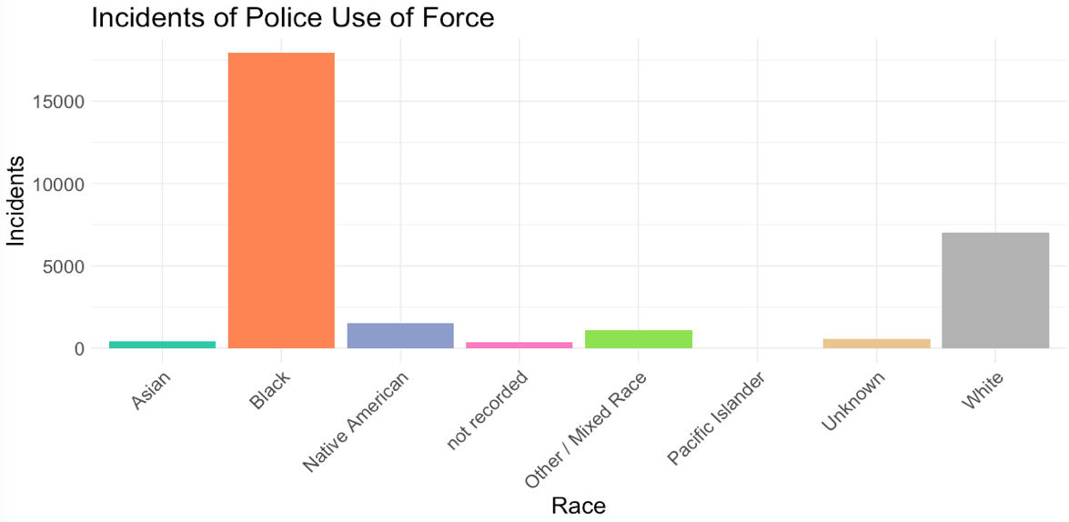
<p>Let’s start with the basic racial breakdown of incidents of police use of force. To be explicitly clear, <code class="language-plaintext highlighter-rouge">Race</code> here is the race of the person upon whom the force was inflicted.</p>

<p><img src="/assets/images/inc_race.png" alt="use of force by race" /></p>

<p>Since 2008, 17,933 (62%) incidents of police use of force have been recorded against black people in Minneapolis. White people come in with 7,033 (24%) – almost 11,000 fewer.  Black people make up <a href="https://www.census.gov/quickfacts/fact/table/minneapoliscityminnesota/PST045219">19%</a> of the Minneapolis population.</p>

<p>For black people, the most common “problem” that brings police and results in these violent incidents is recorded as “Suspicious Person.” The number of “Suspicious Person” reports for white people is less than half of those listed for black people.</p>

<p>The neighborhood with the most records of “suspicious people” that ended in use of force against black people: Downtown West. A neighborhood that is 60% white and only 22% black.</p>

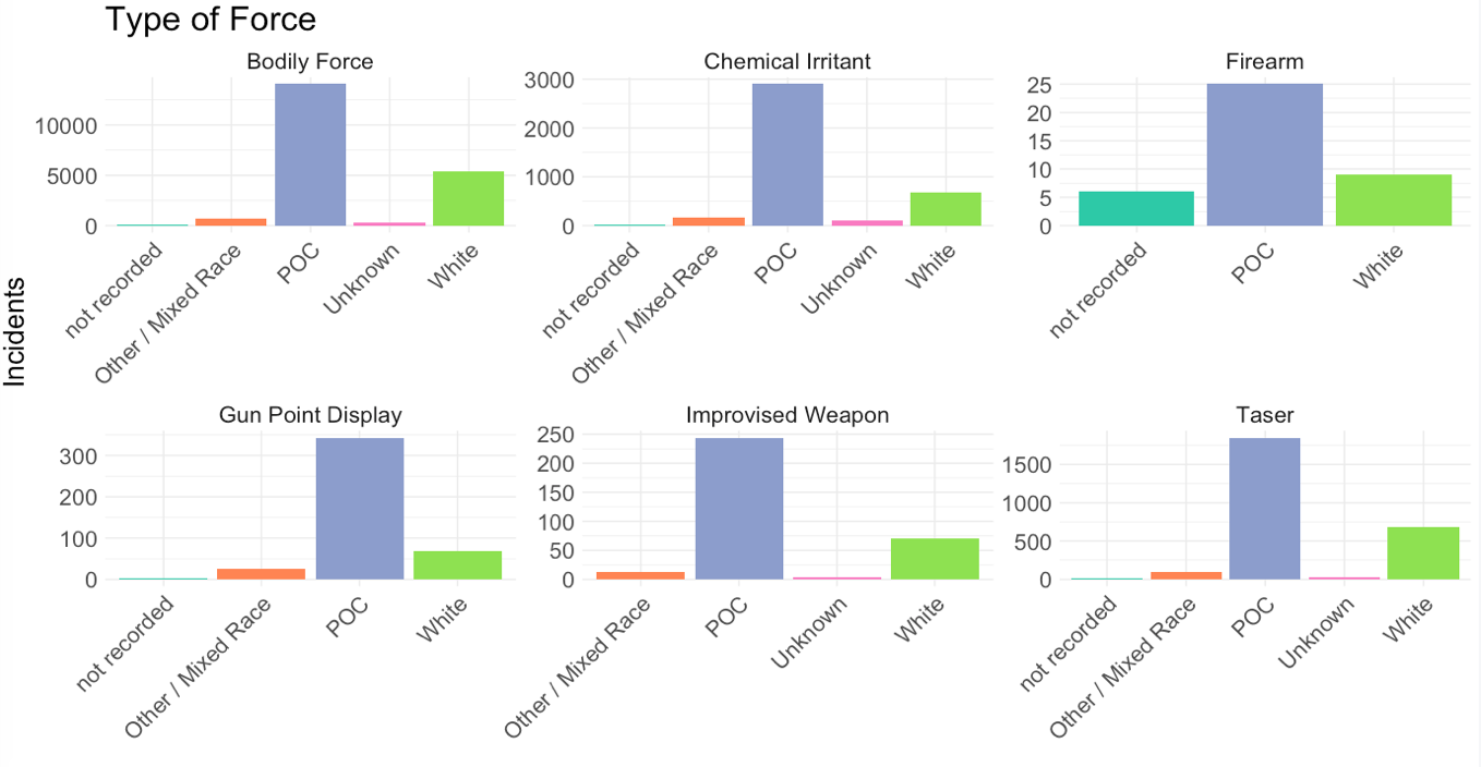
<p>Next, I want you to look at the type of force police use with people of color (POC):</p>

<p><img src="/assets/images/type_force.png" alt="type of force" /></p>

<p>George Floyd is one of the 14,000+ people of color to be counted in the “bodily force” category.</p>

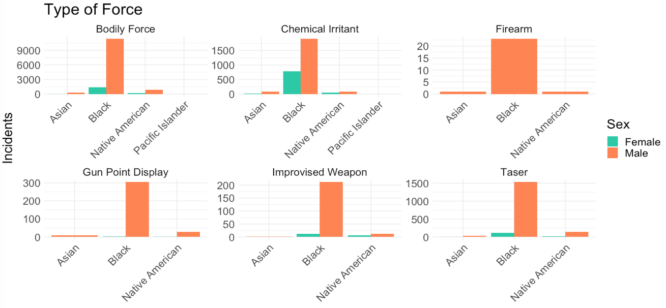
<p>People of color outnumber white people by a long shot. And of all people of color, Minneapolis police seem to use the most force against black people. Specifically black men.</p>

<p><img src="/assets/images/race_type.png" alt="type of force" /></p>

<p>Now that you’re armed with the evidence, here are some things you can do:</p>

<ul>
  <li>VOTE.</li>
  <li>Call your legislators and demand police accountability</li>
  <li>Protest (safely.  COVID is still out there)</li>
  <li>Support the POC in your life and ask them what is helpful.  Don’t assume that you know.</li>
  <li>Donate supplies to protesters</li>
  <li>Educate yourself</li>
</ul>

<p>Where to donate:</p>

<ul>
  <li><a href="https://www.gofundme.com/f/georgefloyd">George Floyd Memorial Fund</a></li>
  <li><a href="https://www.blackvisionsmn.org/about">Black Visions Collective</a></li>
  <li><a href="https://bailproject.org/">The Bail Project</a></li>
  <li><a href="https://www.reclaimtheblock.org/home/#about">Reclaim the Block</a></li>
  <li><a href="https://northstarhealth.wordpress.com/about-us/">North Star Health Collective</a></li>
  <li><a href="https://www.migizi.org/">MIGIZI</a></li>
</ul>

<p><br /></p>

<p><em>This is the tenth in a series of posts <a href="https://julietkelson.github.io/covid/">From Quarantine</a>.  Most posts from quarantine are prompted by Aisling Quigley’s Data Storytelling class at Macalester College.  This is not one of those posts.</em></p>]]></content><author><name></name></author><category term="From Quarantine" /><summary type="html"><![CDATA[COVID Diaries entry — a data essay written in the days after George Floyd's murder in Minneapolis. By Juliet Kelson.]]></summary></entry><entry><title type="html">COVID-19: CDC Compliance: Chicago.</title><link href="https://julietkelson.com/from%20quarantine/COVID-CDC-Compliance/" rel="alternate" type="text/html" title="COVID-19: CDC Compliance: Chicago." /><published>2020-05-23T07:07:47+00:00</published><updated>2020-05-23T07:07:47+00:00</updated><id>https://julietkelson.com/from%20quarantine/COVID-CDC-Compliance</id><content type="html" xml:base="https://julietkelson.com/from%20quarantine/COVID-CDC-Compliance/"><![CDATA[<h2 id="week-10-cdc-compliance-chicago">Week 10: CDC Compliance: Chicago.</h2>

<p>In order to not go completely insane, I’ve been taking a lot of walks.  I try to be careful – I wear a mask and I stay 6 feet from others whenever possible – but there is one problem that I keep <em>running</em> into… (it will be a pun, trust me.)</p>

<p>Usually I can sense it approaching.  I hear the shoes hitting the ground and the heavy breathing.  And then I turn my head and a runner is breathing <em>into</em> my face with no mask (see, there’s the pun.  Running.).  Maybe it’s just me but I think they try to get as close to my face as possible so they can push their heavy exhales into my lungs. I know.  Gross.</p>

<p>Anyway, budding data analyst that I am, I decided to test my hypothesis.  For what felt like hours but was probably 30 minutes, I stood in my pajamas, notebook in hand, spying on the passersby, and tracking the following variables for 101 people:</p>

<ul>
  <li>Mask (on the mouth and nose)</li>
  <li>Distancing (6ft or it don’t count. Based on my best judgment of if groups were a household, a couple, friends, etc.. Imperfect but most people were not in groups)</li>
  <li>Activity (walking, biking, or running)</li>
  <li>Age (kid, adult, senior.  Everyone was an adult though so I didn’t use this)</li>
  <li>Sex (this is based on my perception and may not be accurate in some cases. Gotta note my biases)</li>
  <li>Compliance (mask OR distancing based on CDC guidelines)</li>
</ul>

<p>Once I had gathered all my data from creeping it was time for the fun part.  Yes, I do find this stuff fun.</p>

<p>I started off with some clustering.  What does that mean? It means I taught my computer all of the information I gathered. I told it to look at all the cases (1 person = 1 case) and group the similar cases into clusters based on the distance between them.  In actuality, it’s more complex and if it makes no sense at all to you, don’t worry. The most important thing to understand here is that we’re looking for patterns in the data.</p>

<p>Based on the data, I found that people broke up into these 5 groups:</p>

<ul>
  <li>compliant male runners</li>
  <li>compliant walkers</li>
  <li>non compliant walkers</li>
  <li>mostly compliant male bikers</li>
  <li>non compliant female runners</li>
</ul>

<p><small> <i> These groups are not perfectly clear cut by variable, but they are pretty close.  If you want the numbers for yourself, shoot me an <a href="mailto:kelsonjuliet@gmail.com?subject=I%20Want%20Your%20Data">email</a>! </i></small></p>

<p>This was a bit surprising to me. I had assumed that men would be less compliant because I have more faith in my gender, but the data called me out on my biases and shows predominantly male groups to be categorized as compliant.  But this does not tell me anything about how many people fall into groups and how the numbers themselves play out.  So I made some graphs because I love a good visualization.</p>

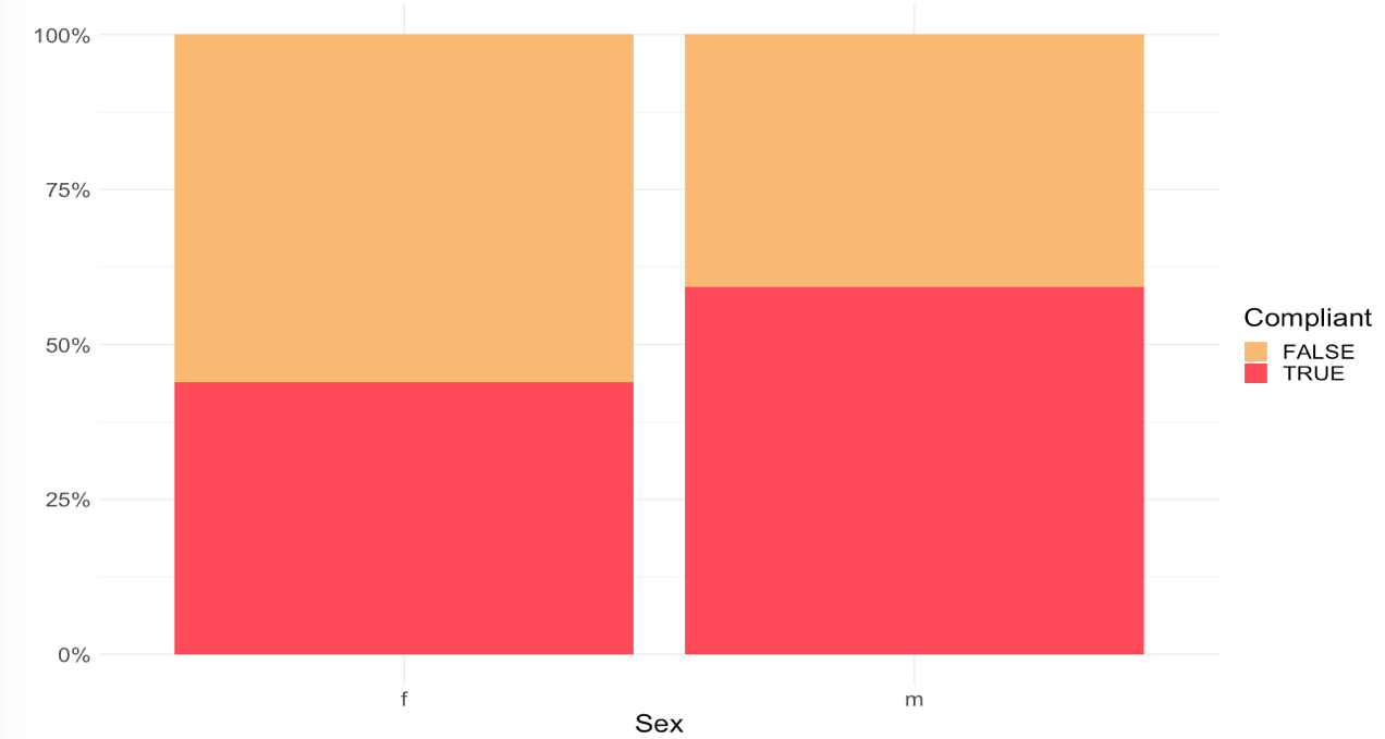
<p>First and foremost, Male vs Female… Not directly related to my runner hypothesis but still interesting.</p>

<p><img src="/assets/images/sex_comp.png" alt="compliance by sex" /></p>

<p>Not only is everyone doing poorly with mask wearing and social distancing, but it appears that women are doing worse than men.  Not great. Work on it.</p>

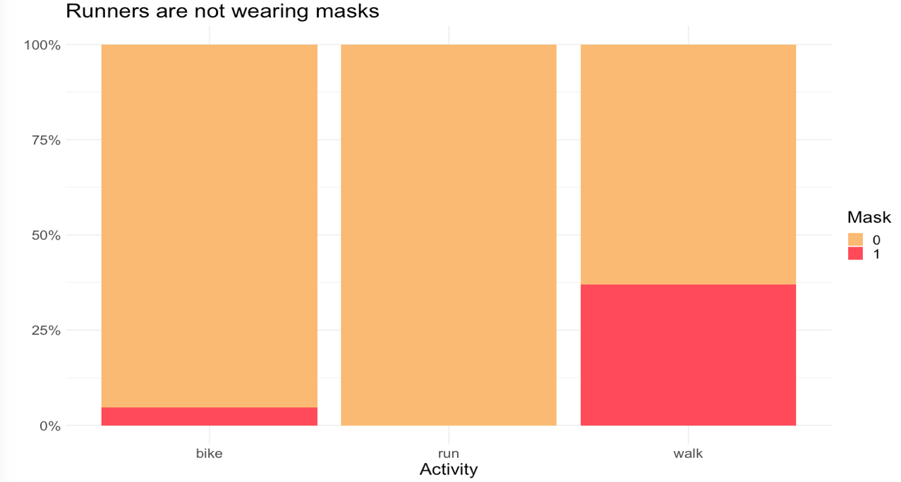
<p>But back to my main point – am I crazy, or are runners being selfish, non-compliant disease vectors?</p>

<p>Let’s look at mask usage first:</p>

<p><img src="/assets/images/activity_mask.png" alt="mask by activity" /></p>

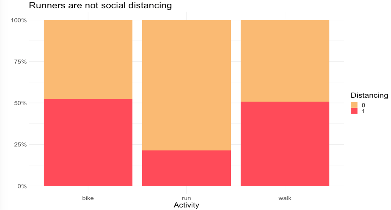
<p>Unsurprisingly, we have terrible numbers across the board, but the worst is for runners and bikers.  This makes sense because it’s harder to breathe wearing a mask if you’re exercising.  Plus if you’re far from other people, you can still follow CDC guidelines.  Let’s see if people are doing that.</p>

<p><img src="/assets/images/activity_dist.png" alt="dist by activity" /></p>

<p>No not really. Bikers in Chicago are in the street where it is easier to be distant so this makes sense.  The non-distancing bikers were people trying to pass each other, people biking side by side, and one full grown adult man biking on the sidewalk.</p>

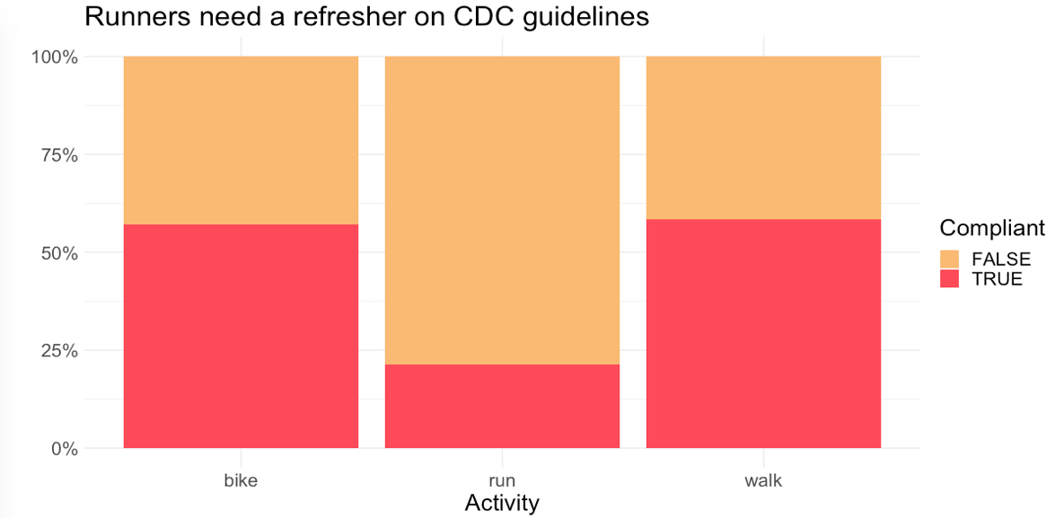
<p>Here’s what it looks like when we put it all together, looking at overall compliance with CDC guidelines:</p>

<p><img src="/assets/images/activity_comp.png" alt="compliance by activity" /></p>

<p>So I guess I was right.  Runners are the worst.  Pull it together. Runners, if you’re out there reading this, just move over. If people walking can do it, then you can do it too.</p>

<p><br /></p>

<p><em>This is the ninth in a series of posts <a href="https://julietkelson.github.io/covid/">From Quarantine</a>.  Most posts from quarantine are prompted by Aisling Quigley’s Data Storytelling class at Macalester College.  This is not one of those posts.</em></p>]]></content><author><name></name></author><category term="From Quarantine" /><summary type="html"><![CDATA[COVID Diaries entry — measuring compliance with CDC social distancing guidelines in Chicago. By Juliet Kelson.]]></summary></entry><entry><title type="html">COVID-19: A Weekend.</title><link href="https://julietkelson.com/from%20quarantine/COVID-A-Weekend/" rel="alternate" type="text/html" title="COVID-19: A Weekend." /><published>2020-05-18T07:07:47+00:00</published><updated>2020-05-18T07:07:47+00:00</updated><id>https://julietkelson.com/from%20quarantine/COVID-A-Weekend</id><content type="html" xml:base="https://julietkelson.com/from%20quarantine/COVID-A-Weekend/"><![CDATA[<h2 id="week-9-a-weekend">Week 9: A Weekend.</h2>

<p>In the dystopian fashion of 2020, I logged onto Zoom Saturday afternoon to watch my virtual graduation. Four years of college bookended by Trump’s election and a pandemic. Different people will have differing opinions on that first one, but if you know me then you know my opinion.  If you don’t know me, I think that Trump is as bad for my health as the pandemic – and I’m immunocompromised.</p>

<p>To add another pinch of pessimism to this post, I decided to document where I was this weekend to compare it to where I would have been if there were no pandemic (unfortunately, Trump is still president in this scenario). Here’s how the weekend was supposed to go:</p>

<p>My family, grandparents and all, planned to come up for the weekend. There were brunches and dinners planned and, of course, my graduation ceremony. My roommates and I were excited to have our families all meeting each other, there would be graduation parties and Senior Week, and it would be a time of happiness and celebration. Not exactly the way things turned out. At the end of the weekend, my family would drive some of my stuff home for me, and later in the month I would drive the rest of it back, and hopefully go on to start my first job out of college.</p>

<p>Here’s how things actually went:</p>

<p>On Friday, I was in my room most of the day while everyone in my house either worked or was in class.  I had dinner with my family, so I suppose that’s similar.</p>

<p>On Saturday, we sold my car to Carmax. We watched both my graduation and CNN’s star-studded, impersonal, umbrella graduation for high school and college graduates where everyone said “sorry this sucks. Here’s some promotional content.” Obama’s speech was nice. I FaceTimed with my roommates. I had dinner with my family. I ate too much ice cream.</p>

<p>On Sunday I had a stomach ache from the ice cream. I hung out with my mom. I napped a lot. I made dinner and ate it with my family.</p>

<p>Sprinkle in some Netflix/Hulu in there and you’ve got a pretty clear picture of my weekend.  Which is not unlike my week days.</p>

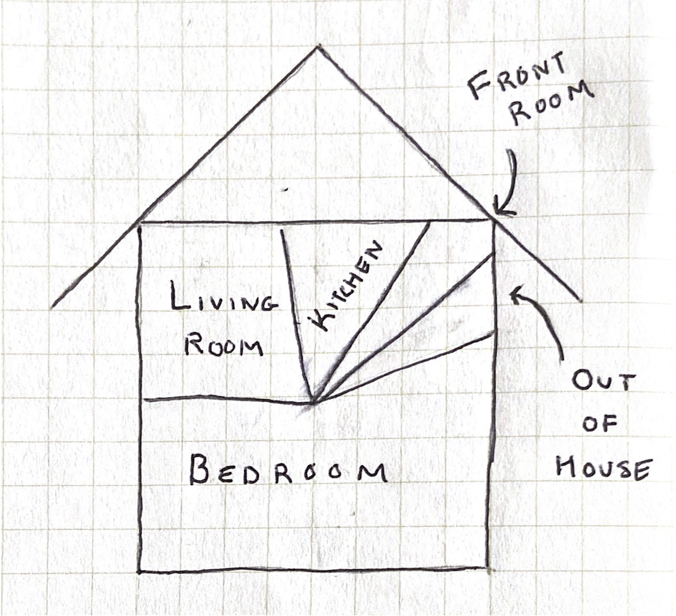
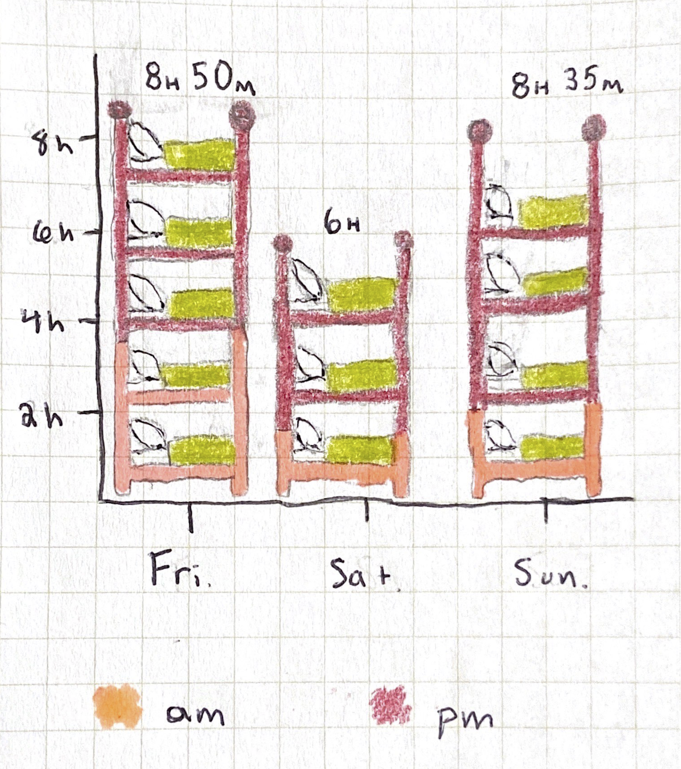
<p>I spent roughly 95% of my time inside the house.  I hate pie charts (even though I love pie), but I made a pie chart that I consider slightly less offensive than most pie charts because it’s meant not to give you real numbers, but instead a depression-inducing glimpse into the amount of time I spent in my bedroom this weekend.</p>

<p><small> <i> A quick note about the data: minutes were rounded to multiples of 5, I didn’t count the bathroom, and I didn’t count time asleep.</i> </small></p>

<p><img src="/assets/images/house.png" alt="house chart" width="600" /></p>

<p>Pretty disturbing, right? I thought so too. I was even shocked about how much of my time I spent in my room. So I broke it down to try to see if there was any way to make it less sad.</p>

<p>Here’s what I found:</p>

<p><img src="/assets/images/sleep.png" alt="sleep chart" width="600" /></p>

<p>Please excuse the Barney colors.  I couldn’t find any pens. If you can see beyond that, you’ll notice most of the time comes from Friday and Sunday.  I can rationalize some of that. On weekdays (Friday), every room in my house is occupied by people who are working or in class. This means that if I’m not in my room, I can’t make noise. My only excuse for Sunday is that I took a nap.  Still, that’s a lot of time to be in my room.  Especially on a weekend where I was meant to be celebrating and having fun with my family and friends.</p>

<p>It’s not all tragic.  My uncle just brought us pies and breads that my aunt made (<a href="https://squareup.com/store/bootleg-batard">buy some here if you’re in/near Chicago</a>). In about a week I’ll be back in Minnesota with my girlfriend. Hopefully I’ll be walking around outside more and writing more positive posts. I’ll let you know.</p>

<p><br /></p>

<p><em>This is the eighth in a series of posts <a href="https://julietkelson.github.io/covid/">From Quarantine</a>.  Most posts from quarantine are prompted by Aisling Quigley’s Data Storytelling class at Macalester College.  This is one not of those posts.</em></p>]]></content><author><name></name></author><category term="From Quarantine" /><summary type="html"><![CDATA[COVID Diaries entry — a data diary of a single quarantine weekend, tracked in full. By Juliet Kelson.]]></summary></entry><entry><title type="html">COVID-19: Music.</title><link href="https://julietkelson.com/from%20quarantine/COVID-Music/" rel="alternate" type="text/html" title="COVID-19: Music." /><published>2020-05-11T07:07:47+00:00</published><updated>2020-05-11T07:07:47+00:00</updated><id>https://julietkelson.com/from%20quarantine/COVID-Music</id><content type="html" xml:base="https://julietkelson.com/from%20quarantine/COVID-Music/"><![CDATA[<h2 id="week-8-late-music">Week 8 (late!): Music.</h2>

<p>This post is being posted in the middle of week nine because of the following excuses that I find valid but you may not:</p>
<ul>
  <li>Finals</li>
  <li>Six hour drive from MN to IL</li>
  <li>My mom’s wedding (in quarantine)</li>
</ul>

<p>Accept it or judge me.  It’s the internet so I’ve prepared myself for both.</p>

<p>Anyway, this week I analyzed my music habits.  I’ve been thinking a lot about music recently because my band, <a href="https://www.facebook.com/geysertheband/">Geyser</a> is finishing up an album.  I know – shameless self promotion. I wanted to see if my music habits have changed since starting quarantine.  I’ll take you through what I found.</p>

<p>I started off by requesting my music listening data from Apple because they don’t have a nice public API like Spotify does.  That took about a week to get and they gave me way more data than I needed, but better too much than too little.  My first question was this: <em>How have my top artists changed?</em></p>

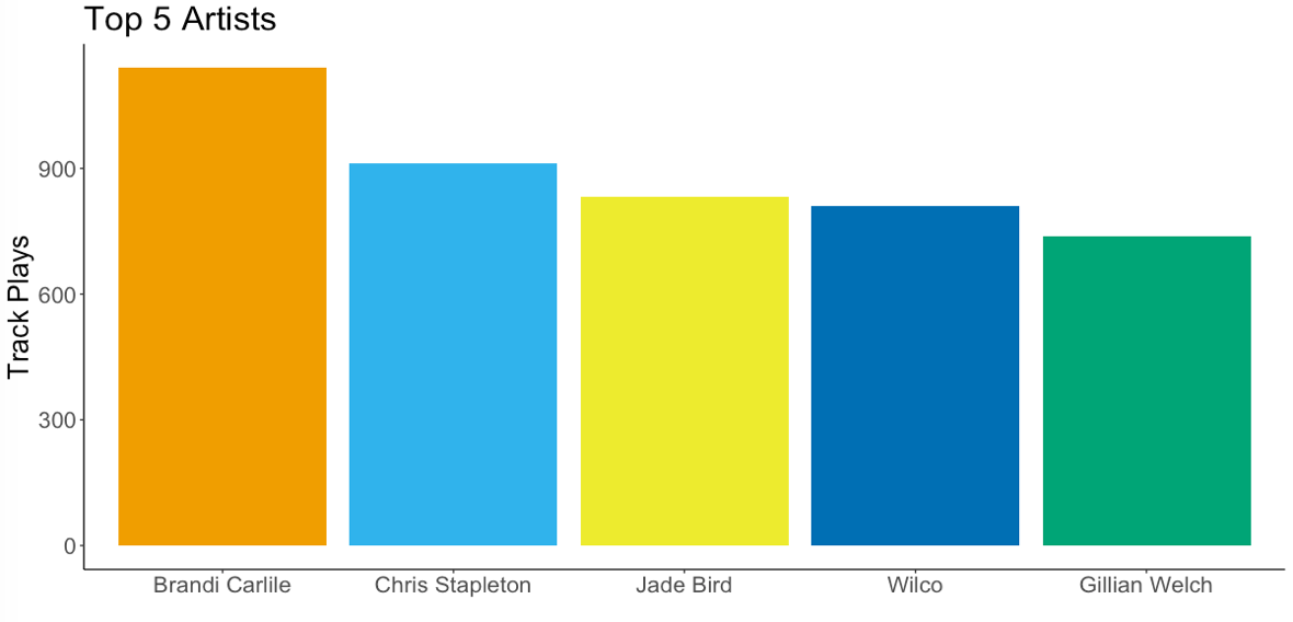
<p>I started off by looking at my all time artists overall (all time being since October, 2015).</p>

<p><img src="/assets/images/artists.png" alt="top overall artists" /></p>

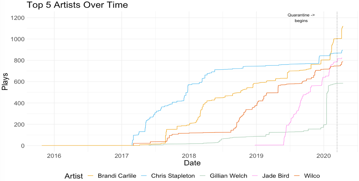
<p>I wasn’t really surprised by this. I go through phases where I find an artist I like and listen nonstop.  That covers Brandi Carlile, Chris Stapleton, and Jade Bird.  Wilco and Gillian Welch are another story.  And I wanted to show you that story so check out the next graph.</p>

<p><img src="/assets/images/artists_ot.png" alt="top artists over time" /></p>

<p>You can see what I was talking about with the obsessive listening: Each of the three artists I mentioned begins with a steep incline when I start listening to them and then either continues up with each new album they release, or flattens out.</p>

<p>Now let’s talk about Gillian Welch.  She’s a long time favorite artist and you see her climbing steadily over time in the graph, but then there’s a sharp uptick in 2020.  That’s because I played her version of Radiohead’s Black Star in a concert and I was trying to learn <a href="https://www.youtube.com/watch?v=attWLjs5WWs">Dave Rawlings’ killer guitar</a> solo note for note.</p>

<p>And finally Wilco. Wilco is the dark blue line. You can see the same pattern that Gillian Welch took where there is a relatively flat but gradual climb and then a quick increase in plays. This one’s slightly embarrassing but what is the internet for if not sharing embarrassing things with the world.  I really like Wilco and their music.  They were one of my first concerts as a kid.  But for the longest time, I felt weird listening to their music because I was friends with the singer’s son and we played music together. But according to this graph, I realized mid-2018 that this was stupid and I listen to their music a lot now because it’s great music and no one cares.</p>

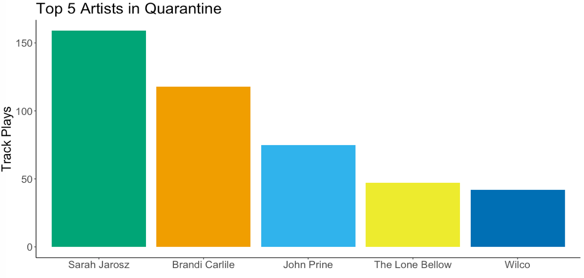
<p>Okay. So I know who my top artists are overall, but who are my top artists in quarantine? Take a look:</p>

<p><img src="/assets/images/artists_q.png" alt="top artists in quarantine" /></p>

<p>Pretty different.  Brandi Carlile and Wilco still make the cut, but my most listened to artist since quarantining is Sarah Jarosz.  I didn’t expect this, but I have been listening to her music a lot. It’s on the calmer side and the instrumentation is really nice.</p>

<p>Next new addition – John Prine.  I was pretty sad to hear that John Prine died from the coronavirus. If you haven’t heard his music, I suggest giving it a listen.  He was a hero to songwriters.  As I write this, I’m in an apartment across the street from the Old Town School of Folk Music where he used to take music lessons and where I grew up learning music. So, I’ve been listening to a lot of his music because his lyrics are the epitome of good songrwiting and his chords are simple and easy to follow.  He once said if you play more than three chords you’re showing off.</p>

<p>Finally The Lone Bellow. I haven’t listened to their music in a long time, but when their new album came out this year, I was reminded of why I used to like them so much.  Their three part harmonies and strong voices are soulful and fun to sing along to.  I had ticket’s to one of their concerts in April.  Hopefully I can see them play the new album in the future.</p>

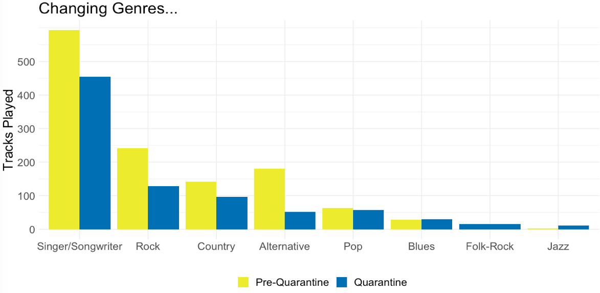
<p>Okay.  Artists are covered. What about genres? The other question I had about my music was how the genres I listened to morphed from before quarantine to now.</p>

<p>I started by looking at seven weeks of music before quarantine, and seven weeks during quarantine so I could compare them responsibly.  My music taste has changed some over time so in order to see if there was a shift. Here’s that information:</p>

<p><img src="/assets/images/genre_d.png" alt="genre change" /></p>

<p>Not really much of a change here in raw numbers, but where there is a change is proportions.  It seems I’m listening to a lot less Alternative music, and I’m listening to a lot more pop, blues, folk-rock, and jazz.  To be honest, I’m not quite sure why that is.  It’s something to think about.</p>

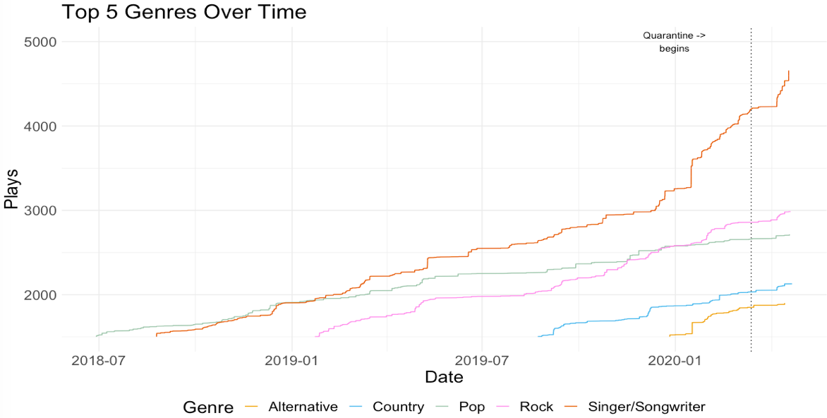
<p>I thought that perhaps if I looked at genres over time I might gain some new insights:</p>

<p><img src="/assets/images/genre_ot.png" alt="genres over time" /></p>

<p>It appears that my increase in alternative music started this year. I think I can attribute this to listening to reference tracks for Geyser’s new singles/album (another shameless plug) a lot as we finished up mixing.  I also see that rock overtook pop. I’m not sure why, but I’m happy about it.</p>

<p>So, I suppose I’ve learned very little from this.  You’ve probably learned more than me but little of value unless you’re very curious about my taste in music.  If you’ve gleaned anything from this post, I hope it’s that there are a lot of reasons to listen to different artists during this time.  While there may not be many new albums coming out, we can find ourselves being drawn to our old favorites for new reasons.  That, and maybe you’ve found some new music to listen to right now.</p>

<p><br /></p>

<p><em>This is the seventh in a series of posts <a href="https://julietkelson.github.io/covid/">From Quarantine</a>.  Most posts from quarantine are prompted by Aisling Quigley’s Data Storytelling class at Macalester College.  This is not one of those posts.</em></p>]]></content><author><name></name></author><category term="From Quarantine" /><summary type="html"><![CDATA[COVID Diaries entry — the album being mixed when the pandemic hit, and what the listening data looks like. By Juliet Kelson.]]></summary></entry><entry><title type="html">COVID-19: Organization.</title><link href="https://julietkelson.com/from%20quarantine/COVID-Organization/" rel="alternate" type="text/html" title="COVID-19: Organization." /><published>2020-04-29T19:07:47+00:00</published><updated>2020-04-29T19:07:47+00:00</updated><id>https://julietkelson.com/from%20quarantine/COVID-Organization</id><content type="html" xml:base="https://julietkelson.com/from%20quarantine/COVID-Organization/"><![CDATA[<h2 id="week-7-organization">Week 7: Organization.</h2>

<p>I hate clutter. I hate clutter but I like stuff. To make matters worse, I am bad at getting rid of stuff. I also love organizing and you can’t organize if you don’t have stuff.</p>

<p>So just to recap there:</p>

<ul>
  <li>I hate clutter</li>
  <li>I like stuff</li>
  <li>I am bad at getting rid of stuff</li>
  <li>I like to organize said stuff</li>
</ul>

<p>Now that that’s out of the way, we can get to the juicy… “stuff”. As you may have guessed, this week I have been tasked with contemplating organization. I find organizing things to be therapeutic. The feeling of completing a task that is not only visually appealing but incredibly useful does wonders for my Virgo brain. I organize my shirts by warmth and then by color, I keep my wool socks and my cotton socks in separate drawers, and I always put my pens back in chromatic order. I even <em>do</em> things with organizational order – I always brush my teeth before washing my face because sometimes you get that toothpaste foam in the corners of your mouth and then you have to wash it off.</p>

<p>So, because organization is a part of my day to day life, reflecting on it overall seemed like too broad a brush to paint this post with. I decided instead to focus on my most recent and largest organizational event: packing.</p>

<p>Even though I don’t go home for a week and a half, I decided on Sunday that the best use of my time would be productive procrastination which led me to pack nearly all of my clothes. I packed three bags – one with winter clothes, one with summer clothes, and one with my dog’s sweater and his bumble bee Halloween costume that I didn’t think he would need while he stays in Nashville with my sister. If you’re wondering, yes I did vomit a bit at the fact that I purchased a Halloween costume for my dog, but he looked very cute in it.</p>

<p><img src="/assets/images/roshBee.JPG" alt="Roshi" /></p>

<p>Every time I have packed up all of my belongings to move during college, I have gotten rid of clothes. It’s less of a thing that I want to do and more of a task that I force myself to do so that I don’t end up with six tee yellow shirts, all of which I “need” because they have slight variations in shade and neckline. I always try to donate my clothes to Goodwill, but in writing this post, I realized that I really have no idea what happens to those clothes once I drive away.  So, I decided to do a little digging.</p>

<p>Here are some things I found:</p>

<ul>
  <li>Americans throw <a href="https://www.theatlantic.com/business/archive/2014/07/where-does-discarded-clothing-go/374613/">10.5 million <strong><em>tons</em></strong></a> of clothing into landfills each year</li>
  <li>Only <a href="https://www.savers.com/sites/default/files/reuse_report_2018-savers.pdf">7%</a> of the population buys second hand clothes</li>
  <li>Only <a href="https://www.savers.com/sites/default/files/reuse_report_2018-savers.pdf">28%</a> of the population donates used goods</li>
</ul>

<p>This means that only a quarter of the number of people who donate clothes buy second hand clothing. Additionally, charities like Goodwill and the Salvation Army sell <a href="https://www.theatlantic.com/business/archive/2014/07/where-does-discarded-clothing-go/374613/">less than 20%</a> of the clothing donated to them.  The rest ends up in the hands of for-profit textile recyclers.</p>

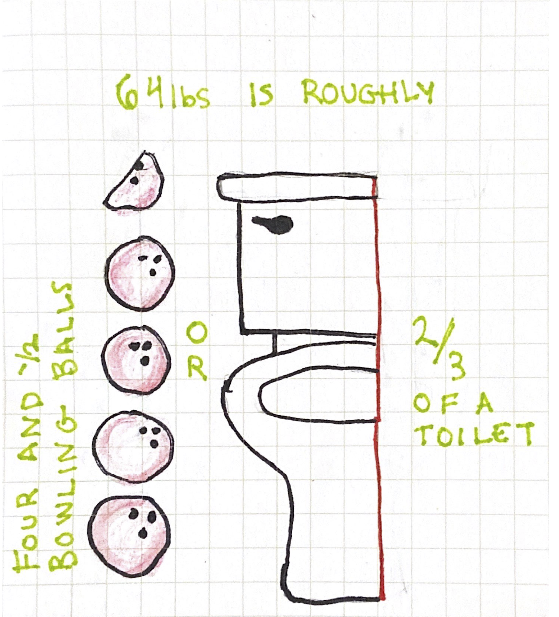
<p>So let’s break that down.  If we divide our disgraceful waste evenly across US citizens we get roughly 64lbs of clothing waste per person annually. This waste in reality would not be equally divided person to person, but for simplicity’s sake let’s assume it is.</p>

<h3 id="thats-a-lot-of-clothing"><em>That’s a lot of clothing!</em></h3>

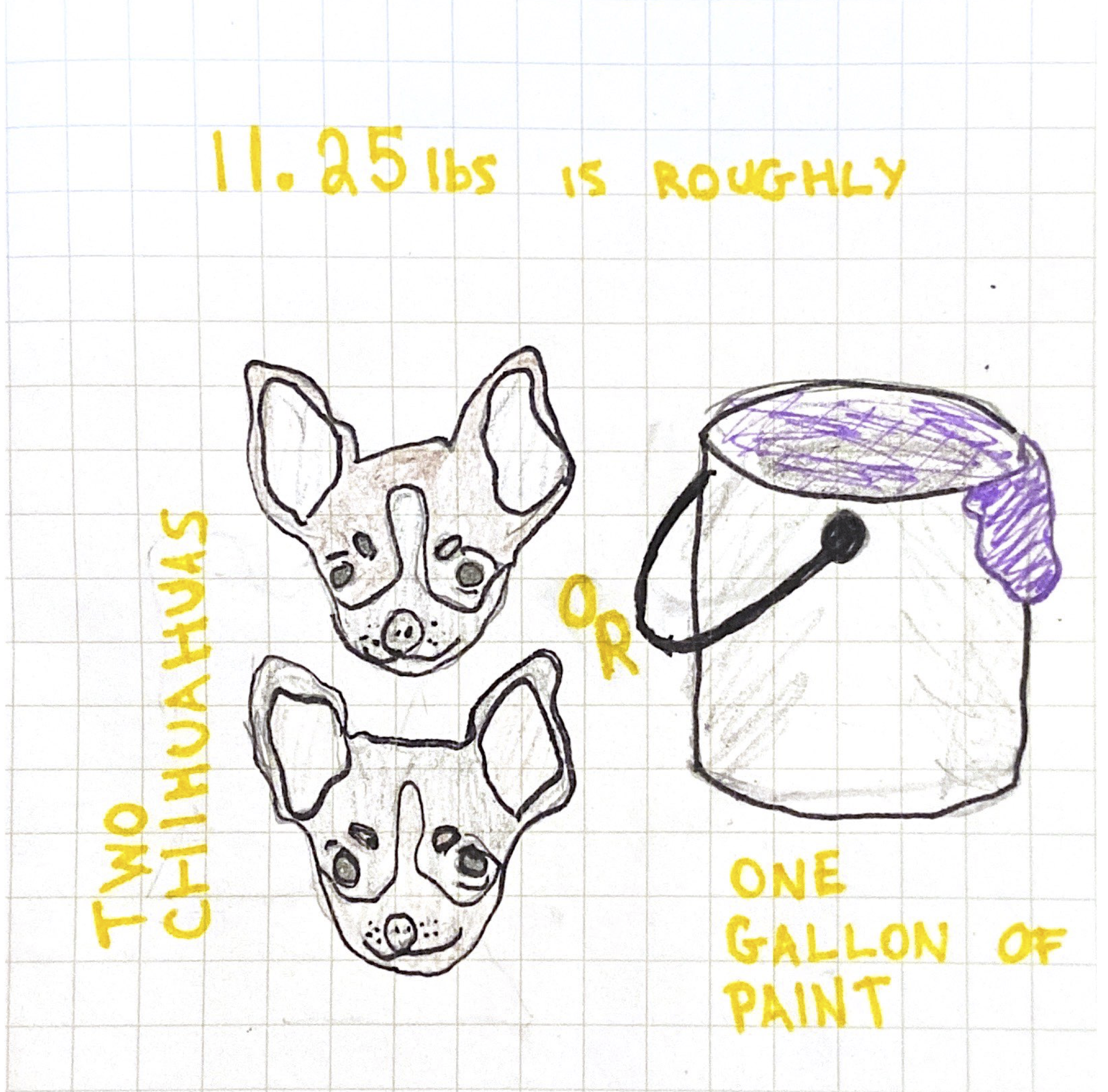
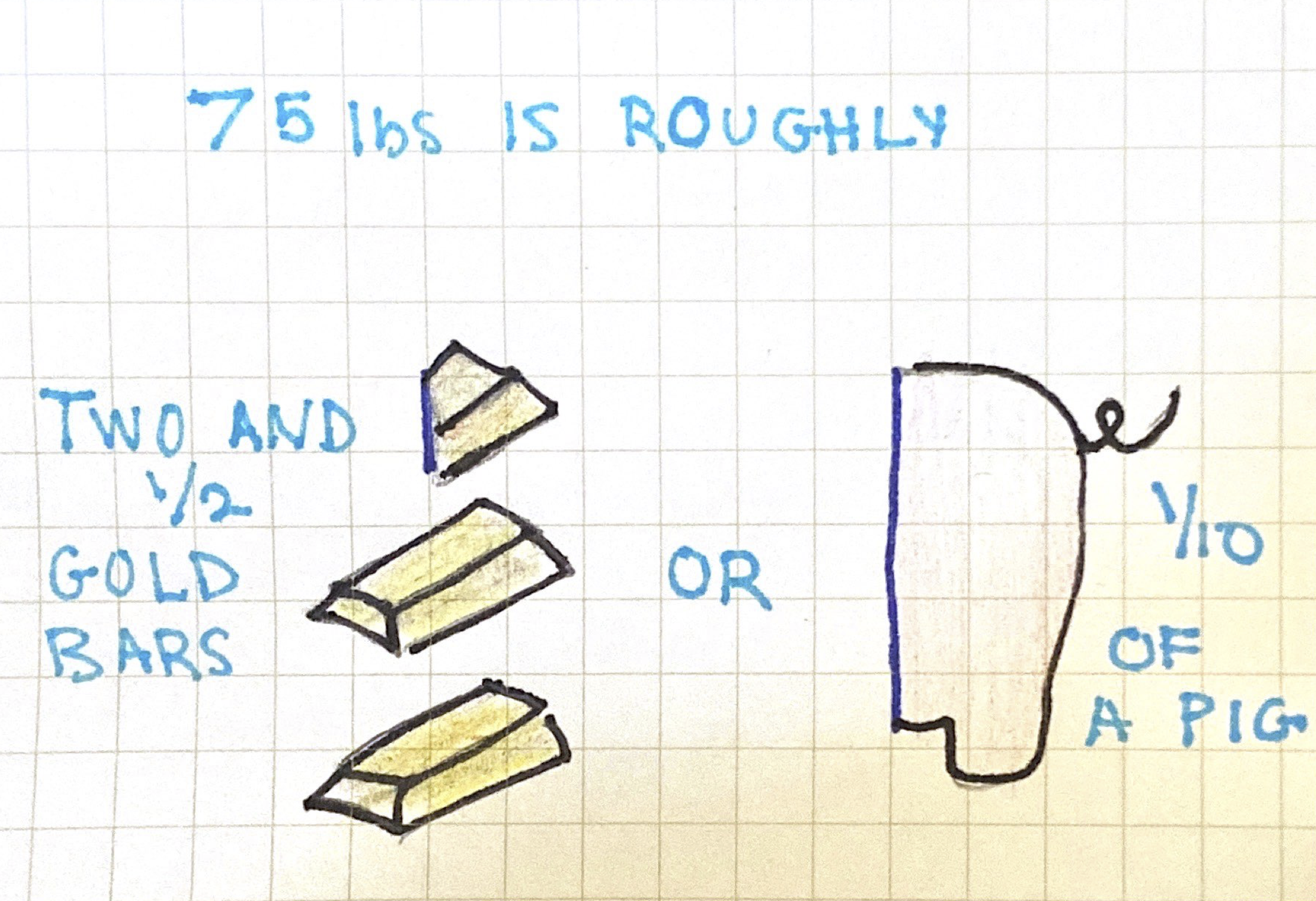
<p>According to <a href="https://www.theatlantic.com/business/archive/2014/07/where-does-discarded-clothing-go/374613/"><em>The Atlantic</em></a>, Americans donate 15% of their used clothes. This means that if we distribute the used clothes evenly like we did above, each American gets rid of about 75lbs of used clothes annually and donates only 11.25 of those pounds.</p>

<p>Here are some ways to think about those weights:</p>

<p><img src="/assets/images/11.png" alt="11lbs" /></p>

<p><img src="/assets/images/64.png" alt="64lbs" /></p>

<p><img src="/assets/images/75.png" alt="75lbs" /></p>

<p>So the next time you think about throwing away your old clothes, try giving them away to your friends, recycling or donating them.  They might not get bought but it’s better than throwing away more bars of gold.</p>

<p><br /></p>

<p><em>This is the sixth in a series of posts <a href="https://julietkelson.github.io/covid/">From Quarantine</a>.  Most posts from quarantine are prompted by Aisling Quigley’s Data Storytelling class at Macalester College.  This is one of those posts.</em></p>]]></content><author><name></name></author><category term="From Quarantine" /><summary type="html"><![CDATA[COVID Diaries entry — using data to make sense of quarantine routines and household organization. By Juliet Kelson.]]></summary></entry><entry><title type="html">COVID-19: Text Analysis.</title><link href="https://julietkelson.com/from%20quarantine/COVID-Text-Analysis/" rel="alternate" type="text/html" title="COVID-19: Text Analysis." /><published>2020-04-22T19:07:47+00:00</published><updated>2020-04-22T19:07:47+00:00</updated><id>https://julietkelson.com/from%20quarantine/COVID-Text-Analysis</id><content type="html" xml:base="https://julietkelson.com/from%20quarantine/COVID-Text-Analysis/"><![CDATA[<h2 id="week-6-text-analysis">Week 6: Text Analysis.</h2>

<p>This week, we’re focusing on text analysis.  Aisling has asked us to take some of the reflections we’ve done since the start of remote classes and put them into the website <a href="https://voyant-tools.org/">Voyant</a> to see what insights we could gain.  I tried this with all of my blog posts and found that my top 3 words were “data”, “quarantine”, and “group”. Not surprising to me, but still, it is interesting to see that the words that follow those top 3 are the names of the people I’ve been with throughout this quarantine process.</p>

<p>I find text analysis to be a very interesting topic in data analysis. Although it’s an area I don’t have much experience with, it’s something I’ve been experimenting with on my own time and want to learn more about. I used this week’s assignment as an opportunity to do that.  To start, I did a sentiment analysis of my blog posts using the R package <code class="language-plaintext highlighter-rouge">syuzhet</code>.  This package is very easy to use and because I just wanted to do a simple analysis, I didn’t get too deep into the “behind the scenes” aspects of sentiment analysis for this project.</p>

<p>The first thing I did was get a basic overall understanding of the different sentiments found in my blog posts:</p>

<p><img src="/assets/images/sentiment.png" alt="sentiments" /></p>

<p>Okay… the highest value that comes back is <code class="language-plaintext highlighter-rouge">positive</code> but that is closely followed by <code class="language-plaintext highlighter-rouge">negative</code>.  What does this mean? How does it work?</p>

<p>What’s happening here is that there is a dictionary of words for each category.  For example, words like “good”, “happy”, and “smile” might be in the <code class="language-plaintext highlighter-rouge">positive</code> dictionary whereas words like “bad”, “unhappy”, and “frown” might be in the <code class="language-plaintext highlighter-rouge">negative</code> dictionary. The text is read one word at a time and if that word is found in one of the dictionaries, it gets counted.  Here’s an example:</p>

<p>Sentence: “I smile when I am happy.  I frown when I am sad.  Today I am feeling good.”</p>

<p>Our dictionaries might look like this:</p>

<div class="language-plaintext highlighter-rouge"><div class="highlight"><pre class="highlight"><code>positive = 
[
  happy: 1,
  smile: 1,
  laugh: 0,
  good: 1
]

negative = 
[
  sad: 1,
  frown: 1,
  cry: 0,
  bad: 0
]
</code></pre></div></div>
<p>That puts our total count of positive words at 3 and negative words at 2.  We can classify this sentence as slightly positive.</p>

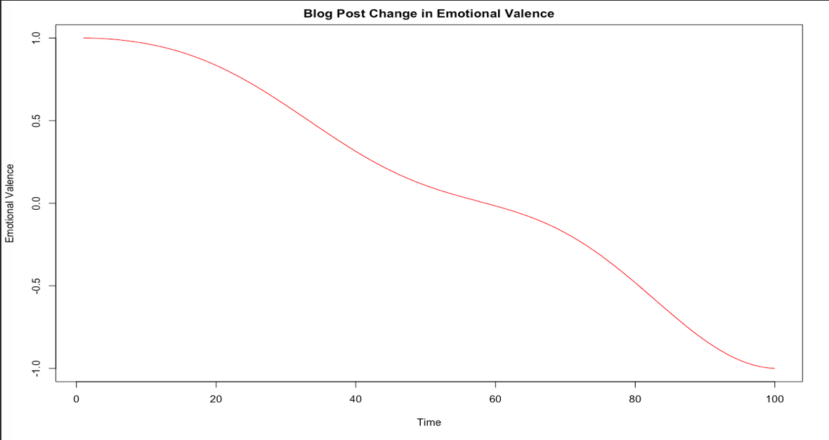
<p>So this is good.  My blog posts have a lot of words that likely signify positivity, joy, and trust.  They also, however, have a lot of words that signify negativity and sadness.  I wanted to see how this trends over time so I used <code class="language-plaintext highlighter-rouge">syuzhet</code>’s functions to plot how the emotional valence changed.  On this graph, I’m only looking at positivity (above 0) and negativity (below 0) trends.  This does not reflect every sentence of every blog post, but instead looks at overall trends on a scale that has my most negative sentiment at -1 and most positive sentiment at 1. We can think of it as a scale relative only to my blog posts – not positivity and negativity in general.</p>

<p><img src="/assets/images/sentimentPlot.png" alt="sentiments" /></p>

<p>Hmmm… I don’t love that, but it makes sense.  My motivation and general positivity have decreased since I began quarantining and this is likely reflected through my activities and thus what I write about.  Again, this does not mean that my most recent posts are extremely negative.  It just means that compared to my personal baseline in these posts, the more recent posts are more negative than the inital posts.  I anticipated this but I was surprised by the severity of the drop and how strictly downward it moves.</p>

<p>Finally, I wanted to do something completely separate: I wanted to use Markov chains to generate text based on the blog posts I’ve already written.  If you want to understand Markov chains for text generation, <a href="https://medium.com/analytics-vidhya/making-a-text-generator-using-markov-chains-e17a67225d10">this post</a> does a fairly good job of explaining without getting too mathematical. I will admit, I am no expert in Markov chains, but I find them amusing for text generation and they’re something that I want to learn more about. From a very, very, very high level perspective, Markov chains use probabilities to move from state to state.  In this case, each state is a word and we are looking at the probability that a word will follow the previous word. We keep choosing words this way until we reach the desired amount of words.</p>

<p>I used the R package <code class="language-plaintext highlighter-rouge">Markovify</code> for this quick text generation. I gave the Markov chain model the following rules:</p>
<ul>
  <li>only replicate <strong>either</strong> up to 5 words in a row of the original text (my combined blog posts) <strong>OR</strong></li>
  <li>up to 40% of a <em>generated</em> sentence can overlap the original text</li>
  <li>the maximum sentence length is 150 characters</li>
  <li>only give me distinct sentences</li>
</ul>

<p>Because my corpus is fairly small, the model did not have a lot of training material.  This means that the output is very limited in possibility and it probably won’t look like something I wrote.  If we gave it the entire Shakespeare corpus, it might be able to replicate his style (to a point), but my ~4,200 words don’t provide much material for the model to learn my writing style. I did it anyway because it’s funny.  Here’s an excerpt from the generated text:</p>

<p><small>Let’s say I’m looking at your phone in the same office every day. For now, I think most young people have a safe place to isolate for two weeks. I think most young people have a safe place to isolate for two weeks. Let’s say I’m looking at your door while you spy from the graph, <em>Rosh Squad</em> exists – to appease Shane. That’s the first week I am in the family. With the quantified self, we’re trying to make GPS tracking more accurate, I don’t have time for that. This is not one but two weeks out of my cute dog, Roshi. This group will soon be moved from the start of quarantine. Mostly, the things that changed around me and I were supposed to go to a party? <br /> So, all of the members are already in a group without Sam? He doesn’t want to be safer with your co-worker. Unsurprisingly, I have an obnoxiously unnecessary number of edges going into or out of hot spots, etc.. Finally, at the first problem. Being as I am in. Two people came in from out of my texting is to my walking pre-COVID. <br /> Samuca and the horizontal line shows the start of week 6. This graph is that I had to. <br /> Unsurprisingly, I have to be in a group to dis her in person. </small></p>

<p>Pretty nonsensical, but entertaining nonetheless.  I wonder how generated text compares sentiment-wise to its training corpus.  A project for another time.</p>

<p><br /></p>

<p><em>This is the fifth in a series of posts <a href="https://julietkelson.github.io/covid/">From Quarantine</a>.  Most posts from quarantine are prompted by Aisling Quigley’s Data Storytelling class at Macalester College.  This is one of those posts.</em></p>]]></content><author><name></name></author><category term="From Quarantine" /><summary type="html"><![CDATA[COVID Diaries entry — analyzing the language of pandemic news and personal messages using text analysis. By Juliet Kelson.]]></summary></entry><entry><title type="html">COVID-19: Data Privacy.</title><link href="https://julietkelson.com/from%20quarantine/COVID-Data-Privacy/" rel="alternate" type="text/html" title="COVID-19: Data Privacy." /><published>2020-04-16T19:07:47+00:00</published><updated>2020-04-16T19:07:47+00:00</updated><id>https://julietkelson.com/from%20quarantine/COVID-Data-Privacy</id><content type="html" xml:base="https://julietkelson.com/from%20quarantine/COVID-Data-Privacy/"><![CDATA[<h2 id="week-5-data-privacy">Week 5: Data Privacy.</h2>

<p>This week, my class has been asked to contemplate data privacy.  If you have not read it already, take a look at the New York Times’ <a href="https://www.nytimes.com/interactive/2019/opinion/internet-privacy-project.html"><em>The Privacy Project</em></a>.  This project describes very well why data privacy matters, the scope of personal data collected on individuals, how it can be used, and how to be safer with your own technology.</p>

<p>I think most young people have a good understanding that when you buy a smart phone and carry it around, it’s collecting data on you.  I looked at this a bit in my post on the <a href="https://julietkelson.github.io/from%20quarantine/COVID-Quantified-Self/">quantified self</a>.  Our phones track information that they share with us (steps, screen time, etc.), but they also collect data that they keep for themselves – or in some cases, sell.  Most notably, GPS data.</p>

<p>In reading this New York Times series, I began to think about how this data might be used to track the Coronavirus and what that would mean for Americans.  This is happening in other countries and is in talks for the US, although we don’t know much about the efficacy of using phone data to track social distancing and contamination.  <a href="https://www.washingtonpost.com/technology/2020/03/24/social-distancing-maps-cellphone-location/">The Washington Post</a> claims that “the U.S. government is in talks with Facebook, Google, and other tech companies about using anonymous location data,” but anonymous location data is easily un-anonymized. The New York Times Privacy Project describes this in detail, but I’ll explain it quickly here too in case you don’t have time for that.</p>

<p>Let’s say I’m looking at your phone data. I might pull all of the records that are labeled with your anonymized ID and be able to see your day to day movement.  In a simple case, you sleep in the same house every night and work in the same office every day. A few Google searches and I could find your name.  This data is not <em>really</em> anonymous.</p>

<p>That’s the first problem.</p>

<p>Now, here’s why I don’t think cell phone data should be used to track things like social distancing or possible contamination.</p>

<p>GPS data on the average smart phone is only accurate up to about <a href="https://www.ion.org/publications/abstract.cfm?articleID=13079">16 feet</a>.  This is why your Uber parks down the block to pick you up.  It’s not their fault. Cut them some slack. While this is remarkable for using softwares like Google Maps, it’s not so good when your social distancing radius is six feet.  If you’re within six feet of another person, a GPS does not know if you’re two feet away or ten. It’s also hard to tell if you’re on the same floor as someone else or not. GPS is even worse with vertical placement than with horizontal. It might appear that you’re giving a piggyback ride to your boss, when in fact she’s two floors above you. And God forbid you forget your phone in the bathroom.  Now the government thinks you are sharing a stall with your co-worker.</p>

<p><em>But Juliet,</em> you might say, <em>every American is quarantining at home.  No one is with their boss and their co-workers.</em></p>

<p>To which I would reply, <a href="https://www.nytimes.com/interactive/2020/04/02/us/coronavirus-social-distancing.html">you are wrong</a>.  Just ask my sister who FaceTimes me every day to show me the congregations of people drinking coffee below her Nashville apartment.</p>

<p>But let’s pretend that you’re right and all Americans are practicing strict social distancing and only going to stores when essential.  Still, the 16 foot radius causes us an issue.  And with regards to spreading infection, this could cause unnecessary panic. What if two people are next to each other at a stoplight in separate cars? Would we count them as potentially infected? Or maybe your Instacart delivery person drops your groceries at your door while you spy from the window. Are they sent some sort of message telling them to get tested for the virus?  Not to mention the issue of noncompliance – what if you leave your phone at home and go to a party?</p>

<p>Sure, there are potential upsides to using cell phone location tracking.  We can look at patterns of movement, see where people congregate, observe migrations in and out of hot spots, etc..  But the government could also attempt to use anonymous data to do things like enforce curfews, track social distancing, or even use identifiable metadata about your texts and phone calls to predict who you’re contacting and find out who you have been with.  And not to sound too patriotic, but would this not be a violation of our fourth amendment rights?</p>

<p>In the Supreme Court case <em>Carpenter v. United States</em>, the court decided it was, calling cell phone location data a <a href="https://www.eff.org/document/carpenter-v-united-states-supreme-court-opinion">“detailed chronicle of a person’s physical presence compiled every day, every moment over years.”</a> Police need a warrant to get these records. I suppose this could be deemed within the interest of national security, but I am no constitutional expert and I’m quickly veering out of my domain.</p>

<p>My point is, while there are ways to make GPS tracking more accurate, I don’t think this would work particularly well and I don’t think it’s worth the potential panic it could cause.</p>

<p>If you’re concerned about your data privacy, take a look again at the New York Times Privacy Project (for which this blog post is quickly becoming an unpaid advertisement).</p>

<p><br /></p>

<p><em>This is the fourth in a series of posts <a href="https://julietkelson.github.io/covid/">From Quarantine</a>.  Most posts from quarantine are prompted by Aisling Quigley’s Data Storytelling class at Macalester College.  This is one of those posts.</em></p>]]></content><author><name></name></author><category term="From Quarantine" /><summary type="html"><![CDATA[COVID Diaries entry — examining the data privacy trade-offs of contact tracing apps during the pandemic. By Juliet Kelson.]]></summary></entry><entry><title type="html">COVID-19: Social Networks. Part 2.</title><link href="https://julietkelson.com/from%20quarantine/COVID-Social-Networks2/" rel="alternate" type="text/html" title="COVID-19: Social Networks. Part 2." /><published>2020-04-07T19:10:47+00:00</published><updated>2020-04-07T19:10:47+00:00</updated><id>https://julietkelson.com/from%20quarantine/COVID-Social-Networks2</id><content type="html" xml:base="https://julietkelson.com/from%20quarantine/COVID-Social-Networks2/"><![CDATA[<h2 id="week-4-social-networks-part-2">Week 4: Social Networks. Part 2.</h2>

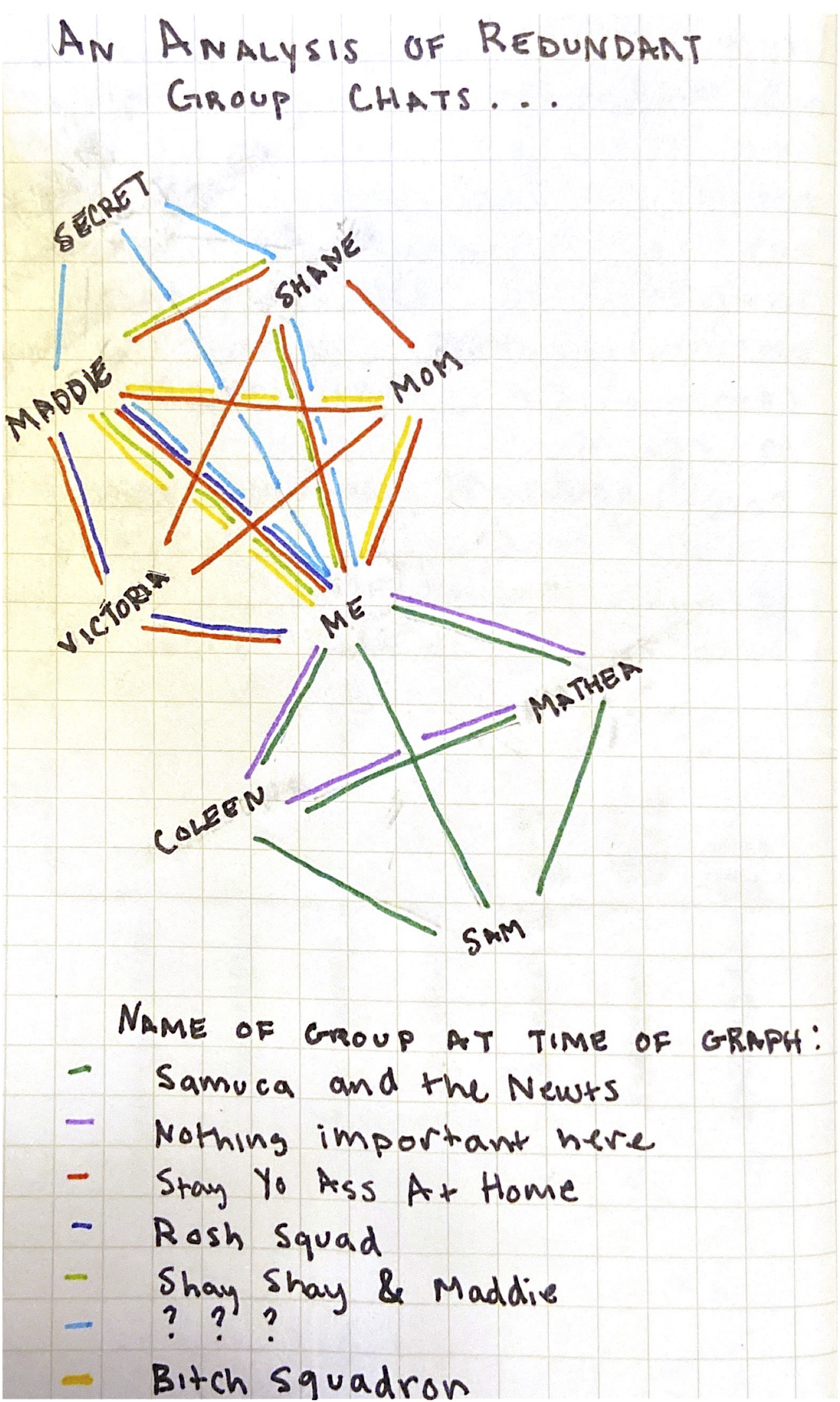
<p>Thinking about social networks made me realize that my typical social networks are all out of whack right now.  Normally I’d be living at home – either in Chicago with my family, or in St Paul, as I am finally doing now, with my roommates.  When I’m with these people I talk to them in person and don’t interact with them as much online.  We communicate mainly with our voices, not our phones or computers.  Since I started quarantining, the people I communicate with has changed a lot.  When I realized this I went right to my phone to look at my texts and had the unsettling realization that I have an obnoxiously unnecessary number of group texts consisting of mainly the same people.</p>

<p>First, here’s what that looks like.  Next, I’ll go through the upsetting reasons they’re all apparently necessary.</p>

<p><img src="/assets/images/GroupChats.jpg" alt="group chats graph" width="60%" /></p>

<p>Let’s start by taking a look at some basic and disturbing facts about this graph…</p>

<p>I’m going to use some terminology here for networks:</p>
<ul>
  <li><strong>Nodes</strong>: each person here is a “node” or, a thing that can be connected to other things to show some sort of meaningful relationship.</li>
  <li><strong>Edges</strong>: each line is an edge.  These edges show how nodes are connected to each other.  In this case, each edge shows two people who are connected by being in the same group chat.  The color tells which group chat connects them.</li>
  <li><strong>Degree</strong>: degree measures the number of edges going into or out of a node.  This helps us understand how important or how connected one node is in relation to others in the graph.  For example, the <em>ME</em> node has the highest degree because this is a narcissistic graph about me and I only care about the group chats I am in.</li>
</ul>

<p>Now some facts:</p>

<ol>
  <li>There are <strong>9</strong> nodes in this graph.</li>
  <li>There are <strong>7</strong> distinct edge colors.</li>
  <li>Unsurprisingly, I have the highest degree. I have more than my sister, Maddie, so this makes me happy.</li>
  <li>My mom is the least connected one in the family.  Sorry, mom.</li>
  <li>Sam is the least connected overall, but this will soon change.</li>
</ol>

<p>So why are these all necessary and why will Sam soon be moved from the bottom? Let’s go through the chats one by one.</p>

<p><br /></p>

<h4 id="samuca-and-the-newts-me-coleen-sam-mathea">Samuca and the Newts: Me, Coleen, Sam, Mathea</h4>

<p>This group must exist because it provides a communication channel among my roommates and me.</p>

<p><br /></p>

<h4 id="nothing-is-important-here-me-coleen-mathea">nothing is important here: Me, Coleen, Mathea</h4>

<p>This group might seem redundant at first glance. Three of the members are already in a different group together.  Why would they need to be in a group without Sam? Because we’re telling <em>~secrets~</em>, that’s why.  Sam’s birthday is April 9th, and this graph was created April 7th.  This group will soon be redundant, but not yet.</p>

<p><br /></p>

<h4 id="stay-yo-ass-at-home-me-maddie-shane-mom-victoria">Stay Yo Ass At Home: Me, Maddie, Shane, Mom, Victoria</h4>

<p>The most juvenile yet semi-appropriately capitalized and most effective name calls upon us to “stay our asses at home” during quarantine. Inspired by Lori Lightfoot memes, this group is a way for the family (and my sister’s girlfriend (but not my mom’s fiance?)) to stay connected and in the loop about the infrequent excitement during the coronavirus.  This group is necessary for family communication.</p>

<p><img src="/assets/images/lightfoot.jpg" alt="Lori Lightfoot" width="500" /></p>

<h4 id="rosh-squad-me-maddie-victoria">Rosh Squad: Me, Maddie, Victoria</h4>

<p>This group seems unnecessary too, right?  While, it’s not.  First reason – it is dedicated exclusively to pictures of my cute dog, Roshi. Now, you’re probably wondering why we can’t send those in the <em>Stay Yo Ass At Home</em> chat.  This is because my brother, Shane, gets bothered by texts that he deems “unnecessary.”  If we remove Shane from the graph, <em>Rosh Squad</em> becomes unnecessary and cute dog pics can stay in <em>Stay Yo Ass At Home.</em></p>

<p><br /></p>

<h4 id="shay-shay--maddie-me-shane-maddie">Shay Shay &amp; Maddie: Me, Shane, Maddie</h4>

<p>This group is for the siblings to talk about our mom without her knowing. It’s necessary.  Next.</p>

<p><br /></p>

<h4 id="-me-maddie-shane-secret-people">???: Me, Maddie, Shane, Secret People</h4>

<p>Why would Maddie, Shane, and I need another group to communicate in? We already have a group to dis our mother in secret and another to dis her in person. You might notice that this group includes other people who are not named on the graph.  This group can be revealed later, but for now it has to remain a secret.  I promise, it’s necessary.</p>

<p><br /></p>

<h4 id="bitch-squadron-me-mom-maddie">Bitch Squadron: Me, Mom, Maddie</h4>

<p><em>Bitch Squadron</em> is the oldest group among the groups.  The OG group chat between a mother and her daughters.  This group exists for the same reason <em>Rosh Squad</em> exists – to appease Shane.  He doesn’t want to be bothered.</p>

<p><br />
So, all of these edges are necessary in the current setup.  As a person who loves efficiency and optimization, I hate this and have found a solution: remove Shane.</p>

<p>This might seem drastic and barbaric, but hear me out.  Removing Shane eliminates three groups – <em>Rosh Squad</em>, <em>Bitch Squadron</em>, <em>Shay Shay &amp; Maddie</em> – because they no longer need to be distinct to avoid disrupting Shane’s day.  Communication that existed in them previously can now flow through <em>Stay Yo Ass At Home</em>.  Removing Shane also removes <strong>14</strong> edges.</p>
<ul>
  <li>The <strong>8</strong> edges that connect to Shane through <em>SYAAH</em>, <em>???</em>, and <em>Shay Shay &amp; Maddie</em></li>
  <li>The <strong>3</strong> edges that connect <em>Rosh Squad</em></li>
  <li>The <strong>3</strong> edges that connect <em>Bitch Squadron</em></li>
</ul>

<p>Considering that <em>nothing important here</em> will also disappear in two days, removing Shane would:</p>
<ul>
  <li>bring the group count to <strong>3</strong> (<em>SYAAH</em>, <em>Samuca and the Newts</em>, <em>???</em>)</li>
  <li>bring the edge count to <strong>14</strong></li>
  <li>bring the node count to <strong>8</strong></li>
  <li>tie my mom and Sam for lowest degree (excluding secret)</li>
</ul>

<p>Sometimes it’s hard to face the facts of science.</p>

<p><br /></p>

<p><em>This is the third in a series of posts <a href="https://julietkelson.github.io/covid/">From Quarantine</a>.  Most posts from quarantine are prompted by Aisling Quigley’s Data Storytelling class at Macalester College.  This is one of those posts.</em></p>]]></content><author><name></name></author><category term="From Quarantine" /><summary type="html"><![CDATA[COVID Diaries entry — a deeper look at pandemic social network data. Part 2. A personal data essay by Juliet Kelson.]]></summary></entry></feed>